


11.23.09
This set is the final we created this semester, and was a direct reproduction of Matinee Gothic, a wonderful typeface designed by Jim Parkinson. I found the typeface when I was trying to find a font with the mysterious M in it, and while this typeface has a much different M, the rest of the letterforms match the one’s from the lot I purchased fairly closely.

This is the Mystery font we tried to match

Here are some of the proofs we pulled of the alphabet.
We went back to white plexi for this set, and got it in the same thickness of the clear set we’d used for Mansard. We also switched glue for this set, using a gorilla glue instead of superglue, which dried much faster, leading to a few small imperfections.
I am thrilled with how well this face printed. I think it looks even better than it does on screen. It was a treat to print a font that wasn’t a direct derivative from any wood typeface I’d seen, but rather an evolution. So, we took a derived typeface back to it’s source and it performed beautifully.

Here are a few blocks after printing. The ink stayed on the plexi better than I expected.

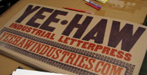
The typeface included these great catch words, which printed quite well
3 Comments on “Matinee Gothic”
Leave a Comment
Related Posts

gilbert bantoft
How do you make your type?
For example the Matinee Gothic
I currently make some out of photopolymer.
Thanks
Gil
08-25-10 » 1:10 am »
Casey McGarr
Do you use a router or CNC to cut these fonts? Please explain it looks great and if its affordable I may try to this in my shop.
Casey
iLp
09-27-10 » 7:41 pm »
Bethany Heck
We actually used a laser cutter to cut through a sheet of plexi, then mounted it to the plywood, which ended up totaling type height. I have used this type in combination with wood fonts on multiple occasions and they work wonderfully. We cut the outlines of the letters into the plywood so we could line them up evenly. It’s a surprisingly simple process, and i’m shocked no one else is doing it. There are two more posts here http://end-grain.net/?cat=10 detailing the process we used. If you want the specs on the plexi and plywood we used, I can get those to you.
09-27-10 » 7:48 pm »