

02.24.10
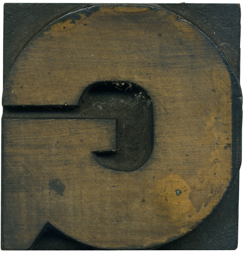
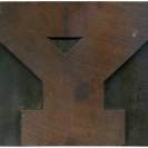
I absolutely love this letterform! It’s so round! It’s got the nearly perfect roundness, but you can tell it’s an early gothic face because of the irregularity between the weight at the serif and the spur. And despite the circular nature of the outer portion of the stroke, the counter is slightly more squared off. If you squint at it, it looks like an arrow looping around. So very graphic and lovely.
This block is a nice small size, it’s fun to handle and examine. This block has some glue around the edge and the face, so it seems it was saved from an eternity as a display piece by some kind soul. There are dark ink stains along the outer edges which make the block even cooler. I haven’t gotten to print it yet, I hope the glue doesn’t affect its print quality.
Style: Gothic
Style first appeared: 1838
Size: 10 Pica
Manufacturer: Unknown
Manufacturing Method: Pantograph
Is it part of a complete set? No
3 Comments on “Jolly G”
Leave a Comment
Related Posts
Ray Nichols
I thought I would share our favorite piece of wood type that we have in our collection at Lead Graffiti.
http://blog.leadgraffiti.com/2010/02/16/handcut-ampersand/
02-24-10 » 11:54 am »
kvh
I love it! It’s almost the same G as this font, (just a little smaller.)
http://www.flickr.com/photos/baltimorecitypaper/3251332248/
02-25-10 » 9:26 am »
Bethany Heck
Wow, Ray, that’s a fabulous block! You should definitely try to create a complete typeface to accompany it, I’ve got a feeling it would be a very satisfying project.
Haha, yes Kyle, they are definitely from related typefaces. That one is just a few thousand times larger! I’ve got my eye on a gothic set that might be the same style as that one!
02-25-10 » 1:44 pm »