


04.20.10
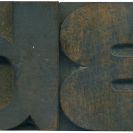
This is a much later typeface than most of the gothics I have been posting (the Rob Roy Kelly Collection website has a font similar to this one). The stroke weight is pretty even, and the lines are very orderly. The counter space is very generous as well. It’s a very open, stoic letterform, and in my opinion, lacking the personality of the earlier grotesque faces. They are useful for providing contrast and calm with combined with more traditional wood typefaces.
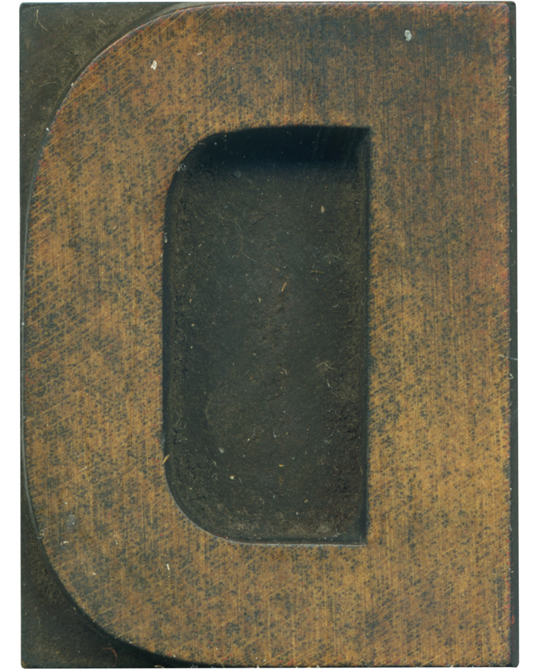
If you zoom in really tight on this block you’ll see remnants of red ink. I think this face would look pretty slick in red, I’ll have to try it out! This is a nice and tidy block, appropriate for a nice and tidy face.
Style: Unknown Gothic Light
Style first appeared: Unknown
Size: 16 line
Manufacturer: Unknown
Manufacturing Method: Pantograph
Is it part of a complete set? No
Leave a Comment
Related Posts