

01.13.11
I don’t post nearly enough Q’s on End Grain. This guy used to be a part of the 514 die stamped font that Page first produced in 1887. But you can see where the top triangle flourish has been trimmed off, presumably so the letter would match another similar typeface. It’s still a lovely letterform. This style has a very nice combination of straight lines and hard angles with some ...
Read More →
01.07.11
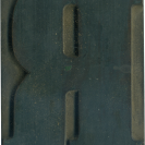
I love grotesque R’s! They are so heavy but always have great lines on the leg. This one slides out just a bit at the bottom, enough to give it visual interest but not distracting. You can see that the edges on this block have cleaned up easier than the rest of it. Style: Grotesque Style first appeared: Unknown Size: 15 line Manufacturer: Hamilton Manufacturing Method: Pantograph Is it part of a complete set? Yes
Read More →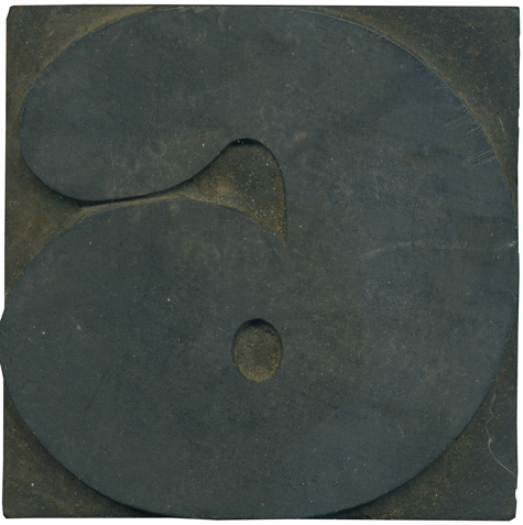
01.05.11
Ah, what a great way to start the year! I love the numerals for this typeface. They are huge and meaty and delectable. I love the ball terminal at the end of the stroke, it gives the number a lot of personality. It’s almost like he’s rocking a pompadour. Style: Antique Style first appeared: 1828 Size: 25 line Manufacturer: Unknown Manufacturing Method: Pantograph Is it part of a complete set? Yes
Read More →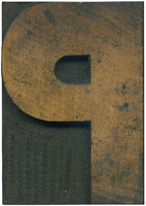
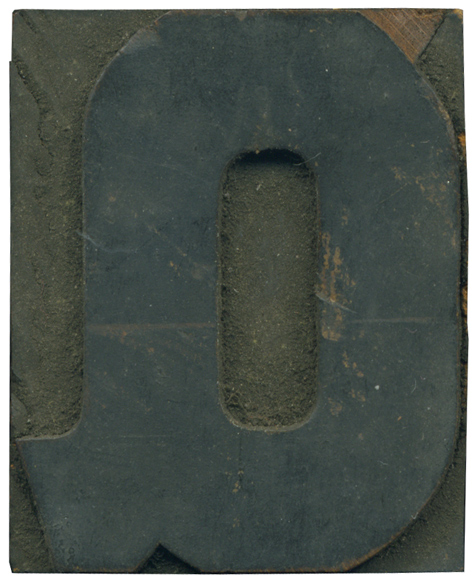
12.29.10
I hope everyone had a lovely Christmas! This is a very handsome P, it’s nice and beefy and well balanced. The top of the letter seems to have a thicker stroke than the rest of it. The face has a little bit of staining with some nice round spots that make it very lovely. Style: Gothic Style first appeared: Unknown Size: 15 line Manufacturer: Hamilton Manufacturing Method: Pantograph Is it part of a complete set? Yes
Read More →