05.10.10
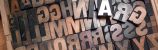
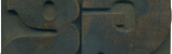
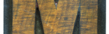
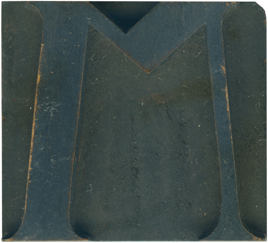
Back in February, Mr. Wolske posted this curious M on his Letterpress Daily blog. According to that post, this is an alternate M (the Rob Roy Kelly site has a different M in their De Vinne showcase). It’s certainly an odd letterform, with its extremely shortened central portion, and it wasn’t until I read Mr. Wolske’s post that I was certain it was an M and not a W. I love the middle portion of the stroke where it suddenly changes width. It looks like some sort of insect, it’s definitely got an organic twist. You can see the grain of the wood on the edges of the face, where it’s been beaten off over time. The ends of the serif have been beaten down a little, and they probably won’t show up in prints.
Style: De Vinne
Style first appeared: 1895
Size: 9 line
Manufacturer: Unknown
Manufacturing Method: Pantograph
Is it part of a complete set? No
Leave a Comment
Related Posts