

03.01.10
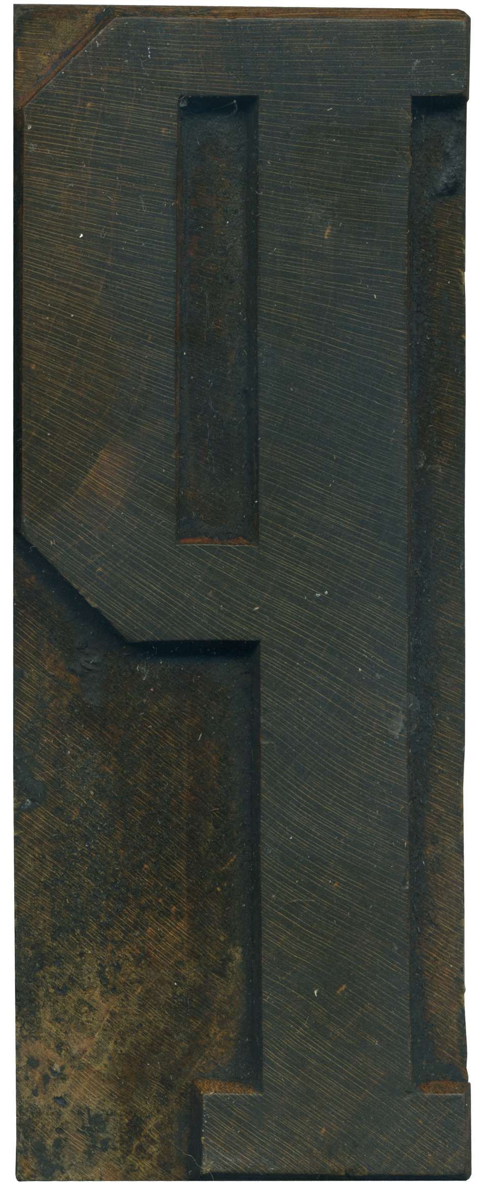
Continuing the blocks form the Grecian set, here in a rather stately P. I really love the differences in weight in this version of Grecian, and I like how those qualities and manifested in this letterform. The main vertical stroke is nice and thick, the horizontal weight forming the bowl are thinner, and the left side of the bowl is the same thickness as the stem. There’s also a variation in thickness between the top and bottom of the bowl. The top stroke mimics the weight of the serif, and the bottom is just slightly thicker, which I like, because it keep the heaviness of that vertical part of the bowl from feeling like it’s going to collapse back onto the stem of the letterform.
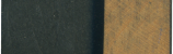
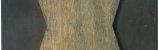
The shoulder on this block is fairly clean, which lets you see the grain very clearly, which, if I’m understanding Mr. David Shields correctly, is a sign that this block wasn’t finished like most blocks made by manufacturers. You can run your fingers over the surface and feel the grain, which is a rather odd sensation. The grain still shows clearly in the face of the letter, I love the area on the left side of the bowl where the wood suddenly changes colors, then fades back to the darker shade.
Style: Unknown Grecian
Style first appeared: 1846
Size: 28 line
Manufacturer: Unknown
Manufacturing Method: Hand Carved
Is it part of a complete set? Not yet!
Leave a Comment
Related Posts