06.16.10
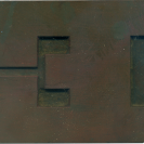
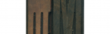
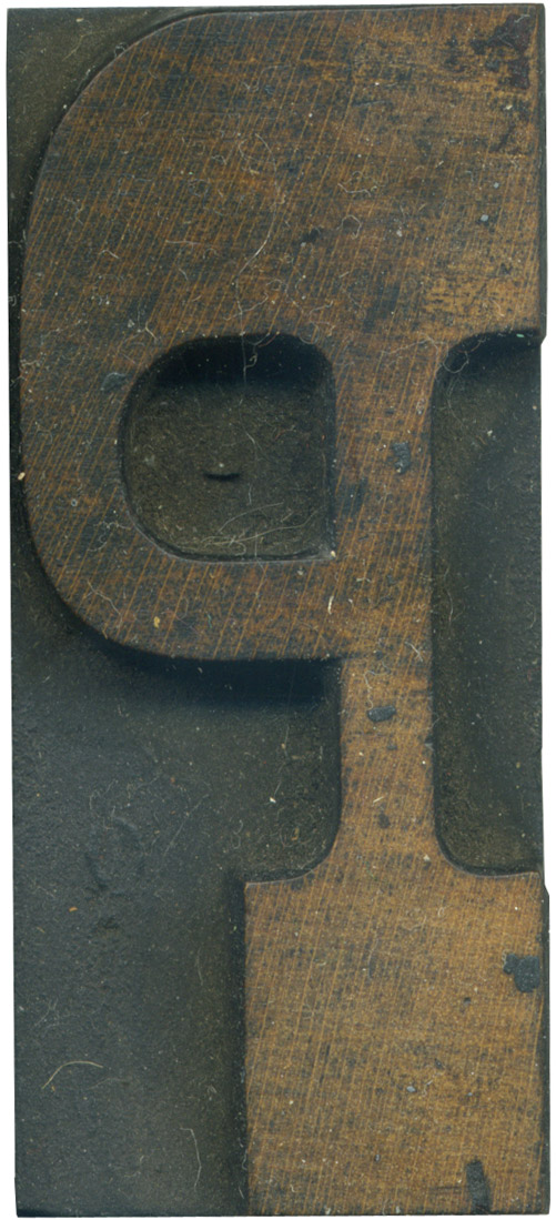
This letterform seems very unbalanced to my eyes. The bowl coming out of the thick serif at the top makes it so top heavy, and it seems like it could top over to the left at the slightest provocation. I love the color of the wood, and how the top of the letter is more stained than the bottom.
Style: French Clarendon No. 2
Style first appeared: 1873
Size: 12 line
Manufacturer: Hamilton
Manufacturing Method: Pantograph
Is it part of a complete set? Yes
Leave a Comment
Related Posts