


04.12.10
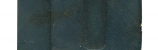
These two guys actually don’t belong together, though they came together in a lot I recently purchased. If you look at the Number 514 specimen page on the Rob Roy Kelly Collection site, you’ll see that the uppercase S should have the same triangular protrusions that the lowercase form does. I think what happened is that the set I bought is actually two similar typefaces mixed together (the other F I have from this set is not nearly as eccentric as this one). What is interesting is that even though they aren’t the same typeface, they have a lot of similarities, such as the concave ends of the stroke. It might be that Number 514 was based on this unadorned typeface, with the angular ornamentations added.
&specname[]=Courier&specname[]=No%20514&specname[]=Teniers&specname[]=Trenton&specname[]=No%20506&specname[]=No%20500&specname[]=No%20500&specname[]=Corinthian%20No%202&top=lineal&folder=B_3_3B&text=RRK_B_3_3B_018.rtf&img=B_3_3B_Spec_018.jpg&count=18&countmax=23)
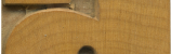
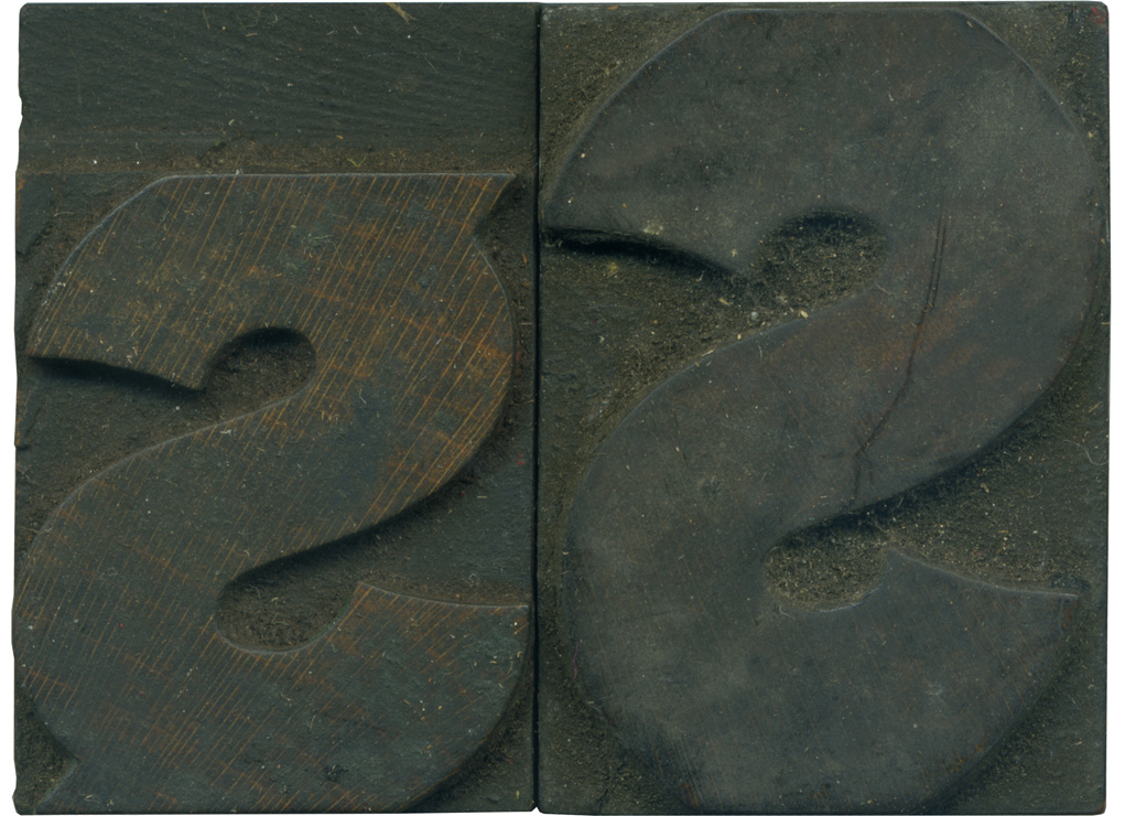
The lowercase block has clearly seen less use than its partner, which is common, though you can just barely see the grain on the uppercase form, and I think it will clean up very nicely. There’s the smallest hint of red ink on the top right corner. You can see where the edges are starting to round over from heavy use, and how the shoulder is filled with ink. The lowercase block is cleaner, with a nice reddish color. There is an odd part of the shoulder along the top of the face, where the shoulder drops to a lower height. I’m not sure what would happen in production that could lead to that.
Style: Number 514
Style first appeared: 1887
Size: 8 line
Manufacturer: Hamilton?
Manufacturing Method: Die Cut?
Is it part of a complete set? Not Yet
3 Comments on “The Odd Couple”
Leave a Comment
Related Posts

Christopher
Mmm. I love that lowercase s. How about doing a few prints of some of these characters? Maybe an A-Z of all the most interesting letterforms? Or a double sided poster – digital images of the blocks on one side, all set up in the forme, and on the reverve – a hand pulled print! I’d buy that!
Seriously – you have a very enviable collection of beautiful, elegant, curious and weird woodblocks here – it would be nice to see them used…
Although I too love the ‘physicality’ of large wooden type, I have recently purchased quite a lot of metal type and restored an old tabletop press. I am really enjoying the process of using type (albeit smaller and not made of wood!) and using it for what it mas made for. It makes the type a little more ‘real’ if you know what I mean?
You clearly have a passion for the subject and look like you had a great time in Ireland – so lets see some prints!
Chris
04-12-10 » 4:46 pm »
Bethany Heck
Mr. Skinner,
I think the double sided poster is a great idea! I am dying to make some prints, but with work and school and with no good press to print on, I’m having to wait until the university’s SP15 is brought here and the semester ends. Prints will come soon, i hope. I do not want to be someone who just hoards type.
04-12-10 » 7:59 pm »
Christopher Skinner
Just make some prints – whenever you can! Just let me know though!
Please, PLEASE! stop calling me Mr. Skinner – I’m not your tutor! I’m Chris, and I love type – there; I’ve said it. Now I feel like a recovering alcoholic! (TYPOHOLIC?)
I really appreciate your enthusiasm for wooden type, and type in general. That’s why I keep coming back…
Chris
04-23-10 » 5:51 pm »