03.30.10
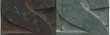
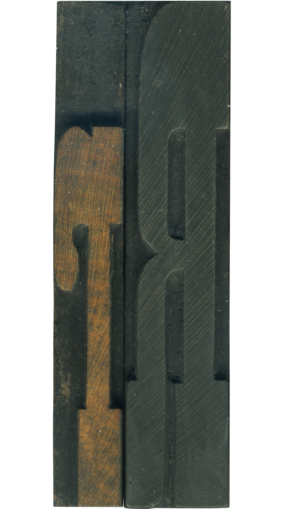
I love these upper and lowercase pairs! These are from my French Antique set, so they feature exaggerated slab serifs. I love the slope on the bottom right side of the leg on the uppercase block. It gives it that little touch of personality. The lowercase R is very playful with its curves and short stature. If you look very closely at the lower serifs you can see the height differences at the tops, one of the imperfections that come from hand finishing blocks.
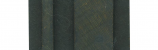
The lowercase block isn’t nearly as stained as its counterpart, and has a great color on the face. The uppercase block is stained black, but some of the grain still shows through. It’s quite filthy from frequent use, this alphabet was used heavily and often. The edges of the face are also slightly worn and rounded, another sign that it was a well loved typeface.
Style: French Antique
Style first appeared: 1869
Size: 15 line
Manufacturer: Hamilton
Manufacturing Method: Pantograph
Is it part of a complete set? Yes
Leave a Comment
Related Posts