
11.18.10
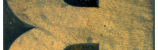
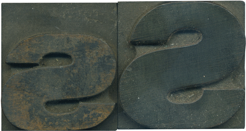
I love comparing the upper and lowercase forms of letters when both are similar to each other. Oftentimes they are more different than they look at first glance. The lowercase S is very squished; look at how flat the top curve of the stroke is! The lowercase letter is still caked with ink, I love the texture old ink has when it starts to flake off an old block.
Style: Gothic Extended (still researching)
Style first appeared: Unknown
Size: 12 line
Manufacturer: Unknown
Manufacturing Method: Pantograph
Is it part of a complete set? Yes
Leave a Comment
Related Posts