03.04.10
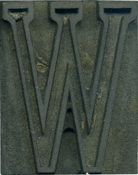
The first mixed lot I bought has a handful of letters in this outlined typeface. It’s the only outlined typeface I have, and I wish I had a complete set. It’s rather tiny, just over 1 in. tall. Blowing up tiny faces to this size reveals a lot of tiny inconsistencies, like the stroke weight, which varies wildly in various places. I love the serifs all lined up ...
2 Comments » Read More →03.03.10
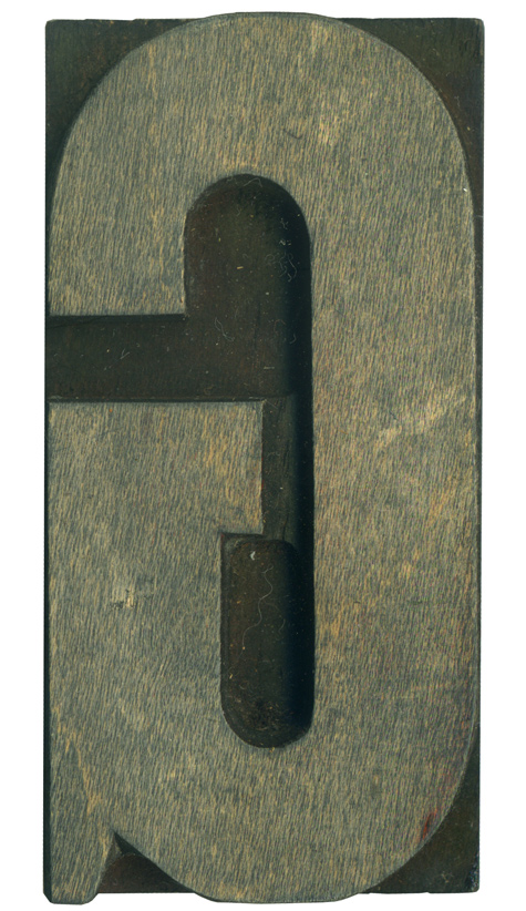
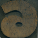
This is a random orphan from a mixed lot, but it has a lot of neat little characteristics. It’s pretty much straight sided, but it’s got really long curves at the top and bottom. The tail is very pronounced, which I love. The serif has a bit of an angle from the hand finishing, and it seems like the top of the stroke flares out just slightly. There is a ...
No Comments » Read More →03.02.10
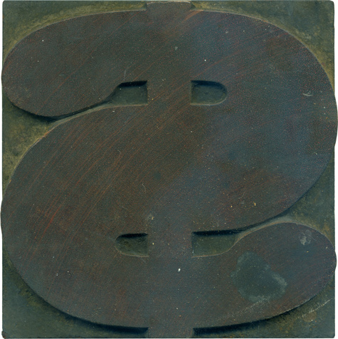
What better typeface to depict a dollar sign than a big meaty antique slab serif? I love the ball terminals at the ends of the stroke, and it’s a great way of making the dollar sign more than just an S with a line through it. The vertical line seems so frail compared to the heft of the swerving stroke. Even for this heft of a typeface, this figure is ...
1 Comment » Read More →03.01.10
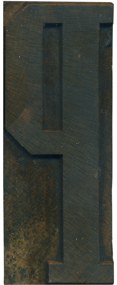
Continuing the blocks form the Grecian set, here in a rather stately P. I really love the differences in weight in this version of Grecian, and I like how those qualities and manifested in this letterform. The main vertical stroke is nice and thick, the horizontal weight forming the bowl are thinner, and the left side of the bowl is the same thickness as the stem. There’s also a variation ...
No Comments » Read More →


