05.14.10
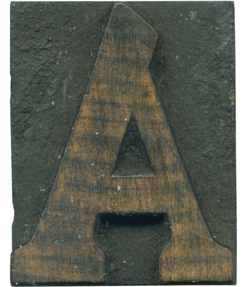
This A was part of one of the first projects I did involving wood type. We had to pick a museum and create a new logo for it and 3 magazine ads, and I used this A in one of the ads. Cheltenham is an interesting typeface, it feels to me like a mixture of clarendon faces and old style. It’s a heavy weight typeface with brackets and thick serifs. This A has that strange offshoot at the top, making it easy to identify.
The wood on this block is absolutely stunning. The grain has a lot of contrast and the color is rich and varies greatly. The striping effect is incredible, and not something I’ve seen often in wood type. This block is rather tiny, so inconsistencies like the left bracket on the right side are more common.
Style: Cheltenham Condensed
Style first appeared: Unknown
Size: 8 line
Manufacturer: Hamilton
Manufacturing Method: Pantograph
Is it part of a complete set? No


