03.02.10
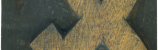
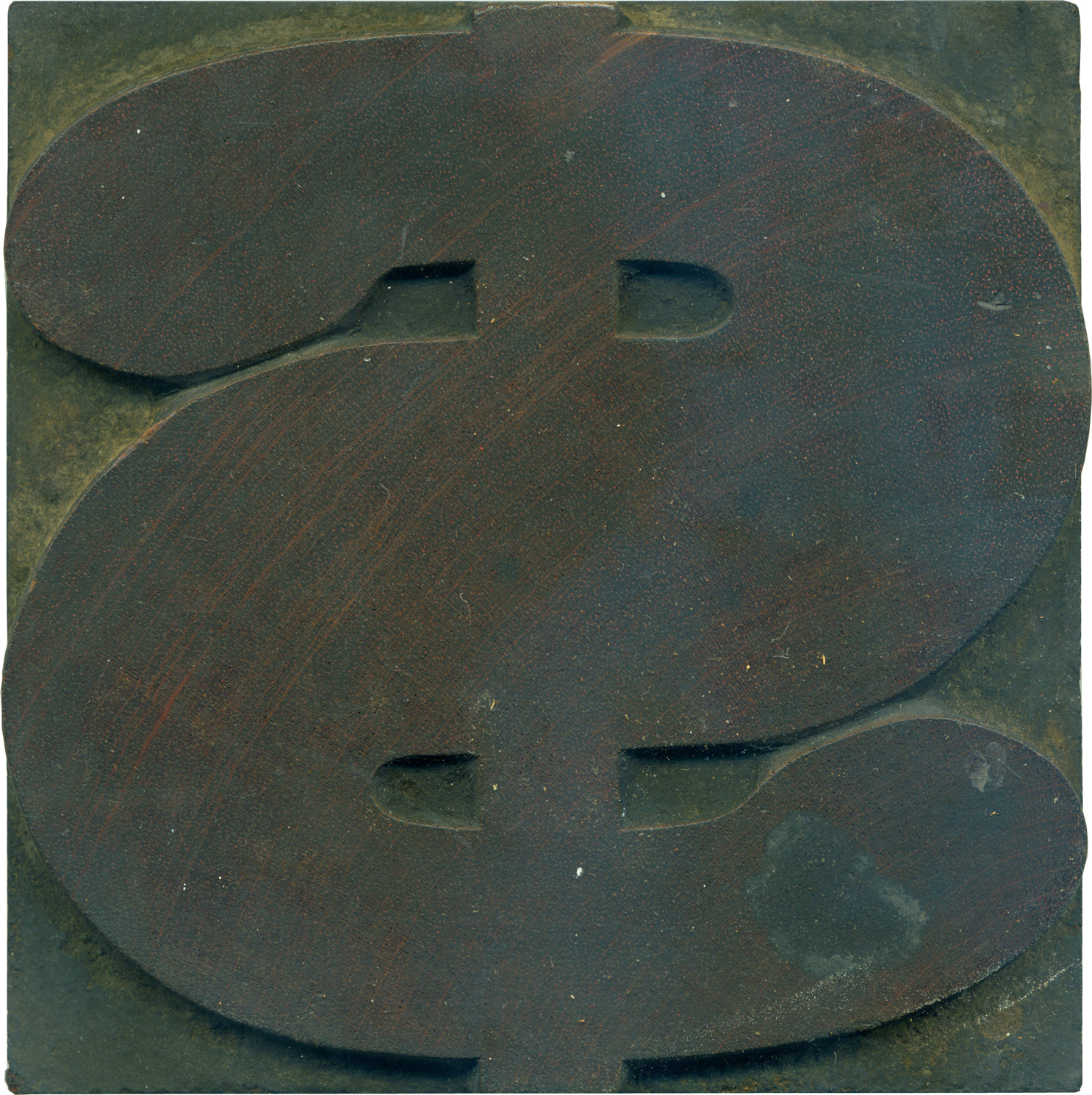
What better typeface to depict a dollar sign than a big meaty antique slab serif? I love the ball terminals at the ends of the stroke, and it’s a great way of making the dollar sign more than just an S with a line through it. The vertical line seems so frail compared to the heft of the swerving stroke. Even for this heft of a typeface, this figure is incredibly thick. The middle horizontal section is just ridiculous, it makes the round terminals seem tiny by comparison. The way the terminals join back to the stroke on the top and bottom differs slightly, the counter on the top is more angular and sharp.
Like all the cleanish blocks from this set, the grain is simply gorgeous. There are lots of traces of red in the pores of the wood, which follows the trend of numbers tending to be red moreso than other figures (though Glenn at the Museum of Printing pointed out that many printers pulled a proof of an alphabet in red right after purchase to increase contrast between the ink and the grain). The shoulder is pretty filthy, so the pantograph makers are hard to spot, but you can see the hand finished details where the terminals brush against the center of the main stroke.
Style: Antique
Style first appeared: 1828
Size: 25 line
Manufacturer: Unknown
Manufacturing Method: Pantograph
Is it part of a complete set? Yes
One Comment on “Cha-Ching!”
Leave a Comment
Related Posts


Why Every Artist Needs a Blog & How to Create an Artist Blog | Anton Amoto
[...] EndGrain » Cha-Ching! [...]
03-09-10 » 1:25 am »