03.10.10
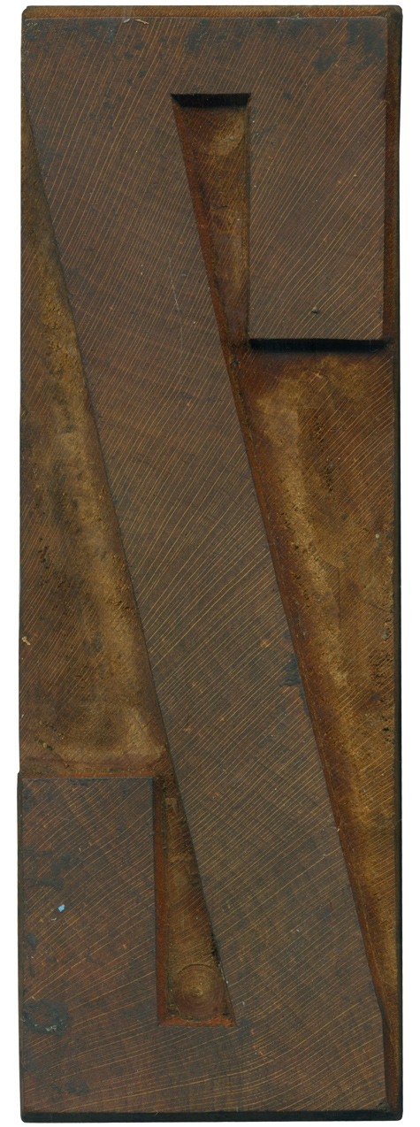
Yay, a Grecian block that isn’t caked with ink! This letterform doesn’t have as many obvious instances of the thick and thin contrast that is a trademark of this particular cut of the Grecian style, but you can see it at the top and bottom. The heaviness of the vertical ends of the stroke are another sign. Often less used letterforms like Zs and Qs are cleaner than the other ...
No Comments » Read More →03.09.10
Besides being a very nice condensed sans serif letterform, this block’s defining characteristic is the painful looking wound on the lower end. It hurts me just looking at it. It might have come from a pair of pliers, perhaps whoever tried to rescue it from a life as a wall hanging got a little overzealous in trying to pull it off of whatever it was glued to. I love the ...
No Comments » Read More →03.08.10
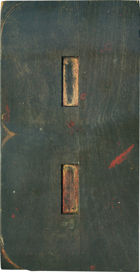
I am partial to the letter B for obvious reasons, so to have one in this nice typeface at such a large size is a real treat. Unlike some of the letterforms from the large poster lot, this B has some really nice variations between the curves, specifically the joint between the two bowls and the top and bottom of the letterform. It’s more squared off in the center, and ...
No Comments » Read More →03.05.10
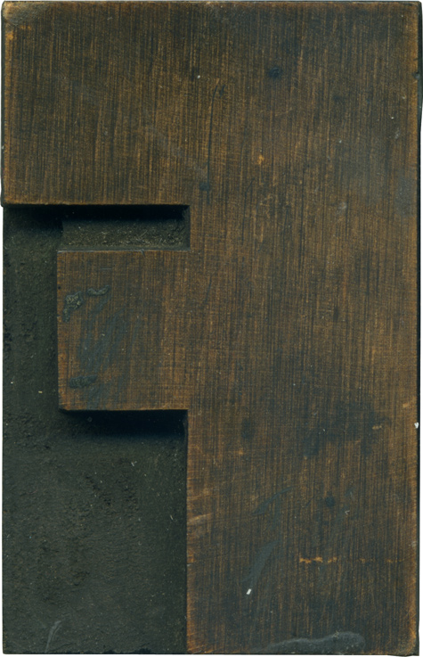
Here is a wonderful F on this Fabuluous Friday. I only have two or three blocks in this style, and I wish I had more. It’s definitely the thickest typeface I have, I’m not sure something this hefty would work on anything other than a sans serif. The difference and size and length between the top and middle arms is fantastic, and the counter space between them is so ...
No Comments » Read More →


