02.05.10
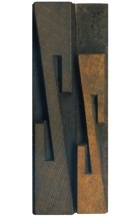
It seems appropriate to end the week with a Z. These are from the French antique condensed set, of which I’ve already posted the A and the W. The style is characterized by extremely tall slab serifs. I really like how geometric and symmetrical the Zs are, they’re really quite aggressive. I like how the squared counters mirror the ends of the stroke, and how they both contrast the angles made by the stroke.
Letters like Z often clean up better than those that are used more frequently, and that is the case here. Almost all of the lowercase letters in this set cleaned up beautifully due to less use. The lowercase block has a great color, with just enough discoloration to show it’s been put to use. The uppercase block cleaned up quite well also, and has those lovely grain lines crossing through.
Style: French Antique
Style first appeared: 1869
Size: 16 line
Manufacturer: Hamilton
Manufacturing Method: Pantograph
Is it part of a complete set? No


![PROFESSOR TOBIN […] SPIRITUALISM’S HUMBUGS / SPIRITUALISTIC JUGGLERY / EXPOSED 💀](https://live.staticflickr.com/65535/54098372074_20bc775da2_s.jpg)
![HERR DOBLER […] ✠ DARK SEANCE ✠](https://live.staticflickr.com/65535/54097172372_f3d1807bd4_s.jpg)
![HERR DOBLER […] DARK SEANCE 👻](https://live.staticflickr.com/65535/54098371949_d42db78b79_s.jpg)


![Red Roses Press [Wood Type]](https://live.staticflickr.com/65535/53488240739_825eec6c1e_s.jpg)


