09.16.10
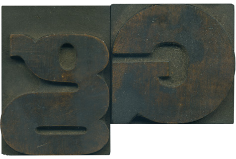
Is there a stranger creature in the wood type world than a lowercase G? They are often squished, disproportionate and deformed, but are almost universally charming. This little guy has a vertically oriented counter, but the bowl at the bottom is little more than a rounded horizontal slit. The connecting stroke in the center is basically the same massive width as the stroke on the uppercase letterform.
It is fascinating to view this pair of letters together. The uppercase G is so uniform and geometric, then you have the lowercase letter with is serpentine lines and heavy thick and thin transitions. One is logical and the other is just odd. They share the same rich wood color and have very little staining. I love the golden highlights in the wood. There is a small wound on the bottom bowl of the lowercase g, I’ll pull a proof of it soon and see if it shows up.
Style: Gothic Extended (still researching)
Style first appeared: Unknown
Size: 12 line
Manufacturer: Unknown
Manufacturing Method: Pantograph
Is it part of a complete set? Yes


Glenn
Ah, the delicious dichotomy of U & lc “G.” My favorite letter!
Welcome back, B!
09-17-10 » 6:12 am »