


04.15.10
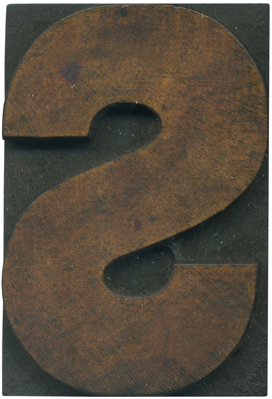
This typeface is interesting to me because it still has elements of the older grotesque faces, but it’s clearly moving into the more modern sans serif direction. The weight shifts are more regimented and the shapes more geometric and uniform. You can see how the stroke tapers at the ends, which makes for a very proper looking, no nonsense S.
The mixture of black and red ink that’s still on this face make for a beautiful block. The color is rich and you can see the grain radiate over the block from left to right. There’s an odd situation with two router marks in the lower middle portion of the shoulder come close to meeting, but the gap in between the stroke wasn’t quite wide enough.
Style: Gothic
Style first appeared: Unknown
Size: 15 line
Manufacturer: Hamilton
Manufacturing Method: Pantograph
Is it part of a complete set? Yes
2 Comments on “Gothic S”
Leave a Comment
Related Posts

Glenn
This one reminds me of a six-line Civil War-era Page wood type font I unearthed at the Museum recently. Ours is more of a square gothic, but the stroke tapers slightly and it’s reminiscent of Gotham Black. Truly ahead of its time. I’ll snap a photo this weekend.
04-15-10 » 7:53 am »
Bethany Heck
I would love the see the font if you can get photos or a print pulled, Glenn, it sounds fantastic!
04-16-10 » 12:15 pm »