12.20.10
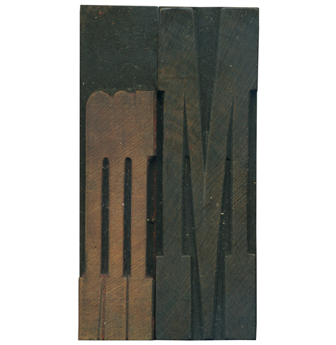
It’s been ages since I posted some of my French Antique letters, so here’s a lovely couple of M’s. As is usually the case, the lowercase letter has seen much less use than it’s older brother. The lowercase letter has traces of red ink in its hairline counters. The lowercase form seems a bit more jolly and friendly than the uppercase M, which has a lot of sharp angles.
Style: French Antique
Style first appeared: 1869
Size: 15 line
Manufacturer: Hamilton
Manufacturing Method: Pantograph
Is it part of a complete set? Yes


