
01.15.10
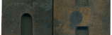
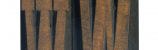
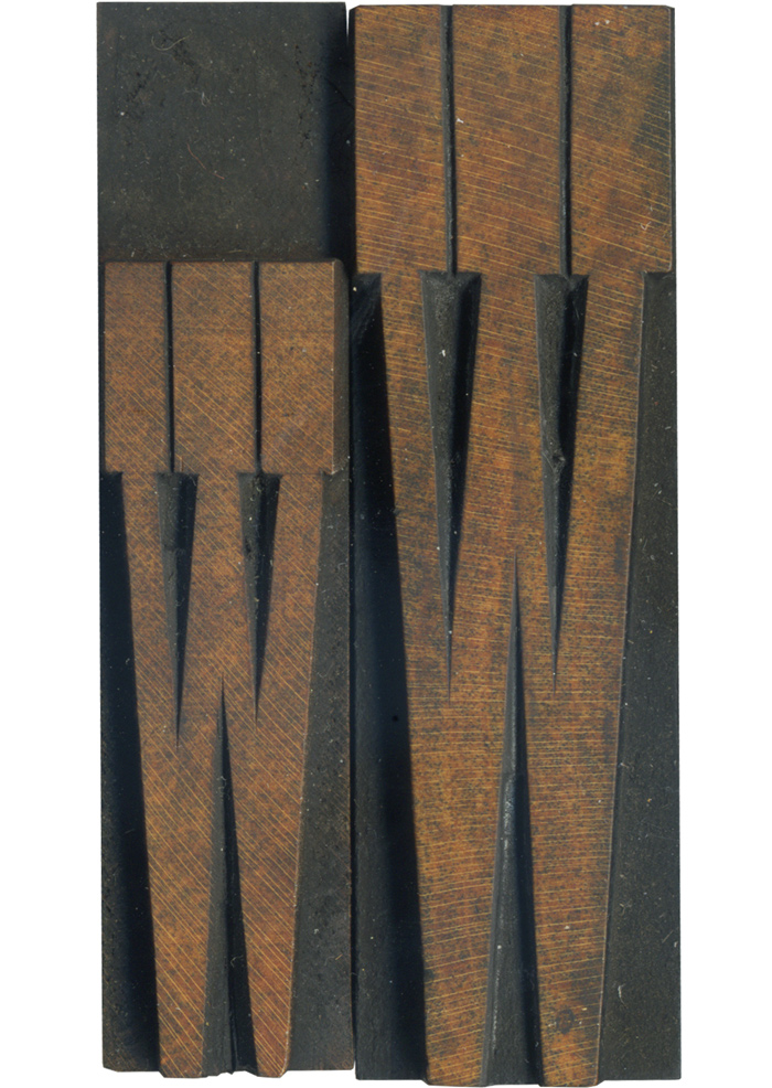
This set of French Antique letters has such a lovely patina. I think the traces of red are what give them such a rich color. One neat advantage to scanning small or extremely stretched letterforms like these is getting to zoom in and see the work that went into hand finishing them.

It’s great to be able to compare the upper and lower case forms of a letter that’s similar in both variations, like a W. The uppercase letter has larger serifs and a thicker face. If you scale the uppercase W to the same height as the lowercase, there are a few subtle differences. The serifs are slightly shorter and the whole letter is just barely wider. This view also shows how irregular hand finishing can be.
Style: French Antique
Style first appeared: 1869
Size: 16 line
Manufacturer: Hamilton
Manufacturing Method: Pantograph
Is it part of a complete set? No
Leave a Comment
Related Posts