10.28.10
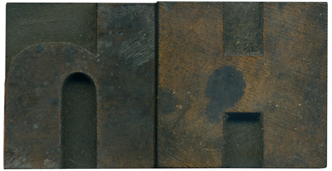
Love the contrast between the right angles of the uppercase H and the curves in his lowercase partner. I love how the stroke on the lowercase letter starts out so thin and skillfully cascades into a huge, thick stroke on the left side. The lowercase letter has some bad scratches that are probably going to show up in a print.
Style: Gothic Extended (still researching)
Style first appeared: Unknown
Size: 12 line
Manufacturer: Unknown
Manufacturing Method: Pantograph
Is it part of a complete set? Yes


