

01.04.10
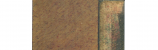
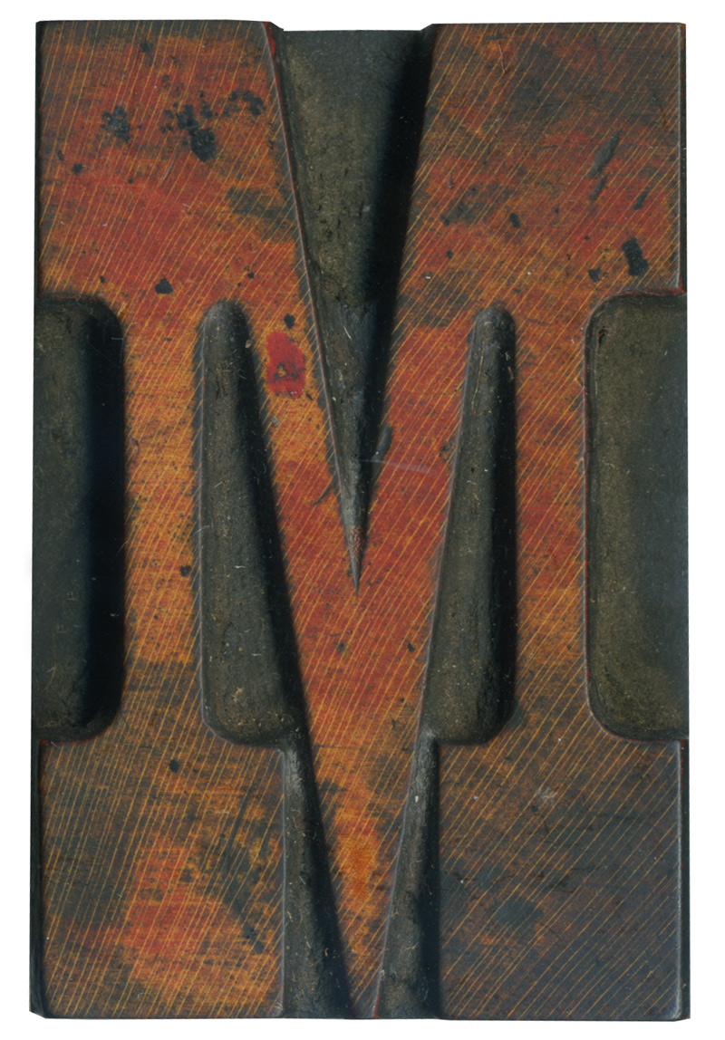
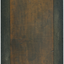
I absolutely adore French Clarendon typefaces. They are one of the first styles I think of when I think of vintage poster type. This letter is from the first complete alphabet I bought, and it’s one of the few from that set that had remnants of a color ink. This face has a a great variety of color and texture. I love the way the black ink has left splotches and the red fades in and out, and to top it off the beautiful color of the wood still shows through.
Style: Fennch Clarendon No. 2
Style first appeared: 1873
Size: 12 line
Manufacturer: Hamilton
Manufacturing Method: Pantograph
Is it part of a complete set? Yes
One Comment on “French M”
Leave a Comment
Related Posts
Nick Sherman
The upper two inner vertices on this block look so rounded that I wonder if they were hand-trimmed at all. The downward pointing angle in the middle definitely looks like it was, but at this size I wonder if the difference for the other two was subtle enough that they thought it was OK to skip. If anyone were to cut corners like that (or, should I say not cut corners) it would’ve been Hamilton. It’d be easier to get an idea by looking at the other blocks from the font.
01-20-10 » 6:00 am »