
09.27.10
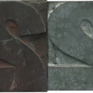
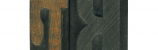
Here is another family pairing form my new gothic set of type. As I’ve mentioned before, I have a soft spot for the letter U, especially when it has an uneven stroke weight. It’s a little more subtle on this one, but it’s thicker on the right side. This is mimicked in the lowercase form, which sharply thins out along the bottom of the stroke. The tail has a outward slant to it, which I think gives it that extra little bit of personality.
Style: Gothic Extended (still researching)
Style first appeared: Unknown
Size: 12 line
Manufacturer: Unknown
Manufacturing Method: Pantograph
Is it part of a complete set? Yes
Leave a Comment
Related Posts