05.06.10
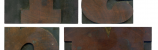
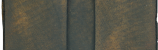
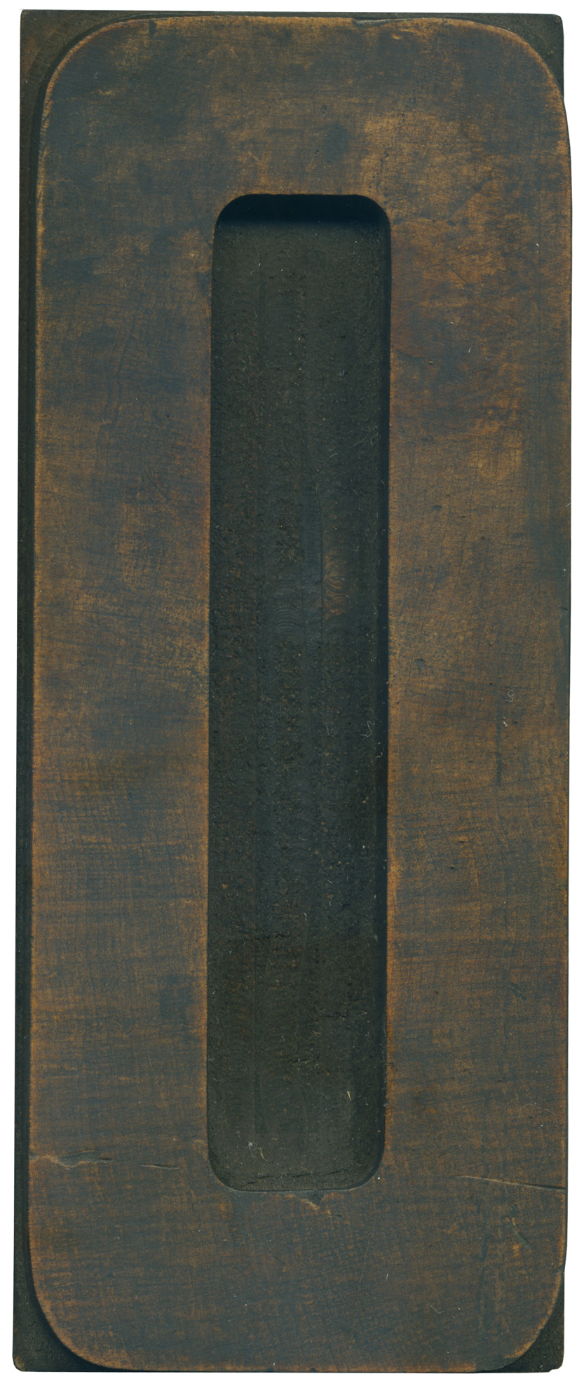
I‘m not sure if this is a zero or an O, or if there is much of a difference. I can’t seem to spot on in the Rob Roy Kelly Collection’s specimen page. Regardless, it’s a great letterform. I love just how squared off the corners are, because you expect much more warmth and roundness from an O. The thin stroke weight seems to make it even more alien.
&specname[]=Courier&specname[]=No%20514&specname[]=Teniers&specname[]=Trenton&specname[]=No%20506&specname[]=No%20500&specname[]=No%20500&specname[]=Corinthian%20No%202&top=lineal&folder=B_3_3B&text=RRK_B_3_3B_019.rtf&img=B_3_3B_Spec_019.jpg&count=19&countmax=23)
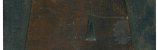
This is about as pretty as an end grain face can get. The wood looks like marble, with loads of tonal shifts. It’s got a small cut across the lower part of the face that will probably show up in prints. The corners on the interior counters are surprisingly inconsistent.
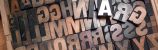
Style: Teniers
Style first appeared: 1884
Size: 24 line
Manufacturer: Unknown
Manufacturing Method: End cut pantograph
Is it part of a complete set? No
Leave a Comment
Related Posts