


02.18.10
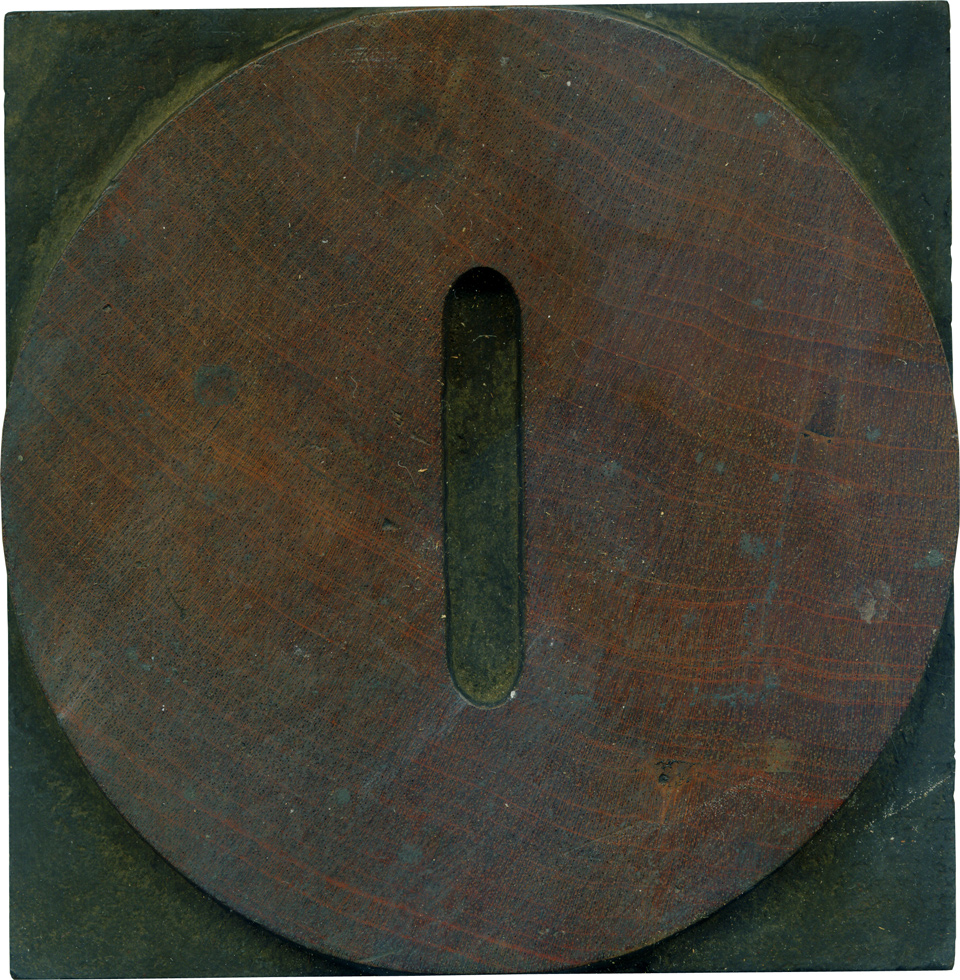
Mmm, a big meaty circle. The difference in this typeface between the Zero and the O is the size of the counter (you can see the whole alphabet on the always valuable Rob Roy Kelly collection website. The narrower counter makes the zero all that more beefy, and the straight sides on the counter make it seem more mechanical, which is fitting for a numeral. It fits very well with the rest of the numerals, which I love almost more than the alphabet on this typeface.
These blocks have the most beautiful wood color when cleaned. It’s so deep and rich, and the grain is always very clear and has a lot of contrast. There’s a bit of a knot on the lower right, which doesn’t show up in the proofs I’ve pulled, surprisingly. The tonal shifts in the grain are just wonderful, if it didn’t have the counter it would look like a planet! I think it’s interesting how the right side has more grain irregularities than the left side.
Style: Antique
Style first appeared: 1828
Size: 25 line
Manufacturer: Unknown
Manufacturing Method: Pantograph
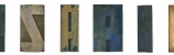
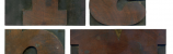
Is it part of a complete set? Yes
2 Comments on “Zero Antique”
Leave a Comment
Related Posts

david Shields
indefensible?
02-19-10 » 12:18 am »
Bethany Heck
Yeesh, that is why I shouldn’t write my posts late the night before! I’m sure I meant to say invaluable. Many apologies, David, I should have caught that mistake.
02-19-10 » 7:31 am »