10.29.10
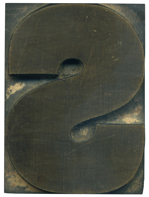
It’s really interesting to compare this block to its gothic cousin. This letter seems more squished into the space allowed on the block, and the ends of the strokes come farther into the middle. The stroke on this letterform is also considerable thicker. These letters offer a great comparison to the differences between a grotesque sans serif and a gothic.
There is a bit of irregularity from the hand finishing on the inner bottom portion of the letter.
Style: Grotesque
Style first appeared: Unknown
Size: 15 line
Manufacturer: Hamilton
Manufacturing Method: Pantograph
Is it part of a complete set? Yes


