
05.11.10
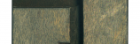
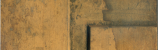
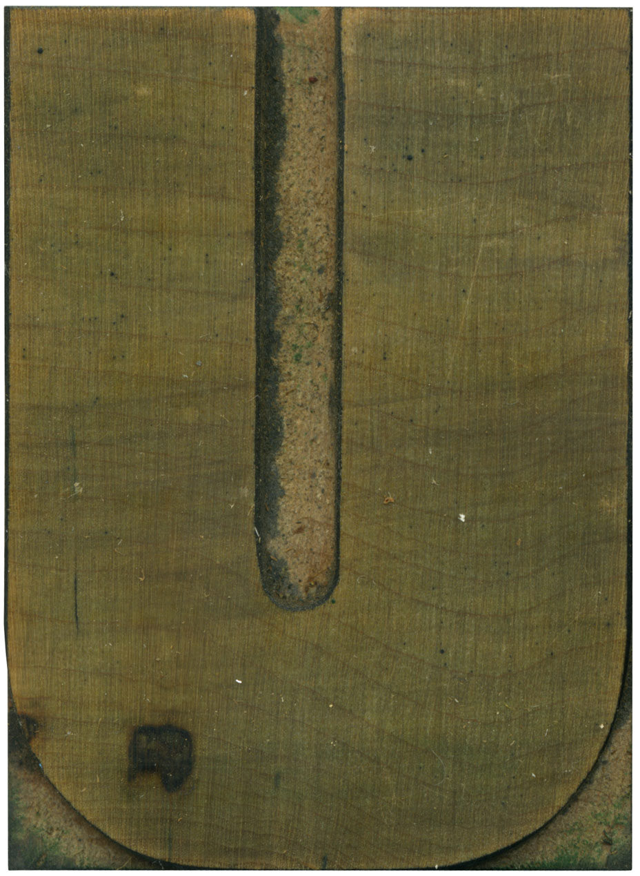
Ah, is there a more glorious creature than the unevenly stroked U? This one is just uneven enough to be obviously intentional. The curves at the base are regimented and even, a trademark of this typeface. I’d love to do a version of this typeface with squared off counters in the interior, it would make the face much more industrial, and it might looking interesting considering the variation in stroke weight.
The blemish on the lower left looks almost like a scorch mark; very odd.I love how the grain lied perpendicular to the vertical strokes, and it crosses over the counter. The shoulder is very clean, most of the blocks in this set have seen very little use.
Style: Gothic
Style first appeared: Unknown
Size: 15 line
Manufacturer: Hamilton
Manufacturing Method: Pantograph
Is it part of a complete set? Yes
3 Comments on “Grotesque U”
Leave a Comment
Related Posts
Terra
hi,
I have your blog on my google reader blog roll and unfortunately none of your images ever come through to my blog roll. Which means I most often just skim past and don’t get to enjoy your posts. Do you think you could investigate what prevents your images from coming through? I am sure others like me would love to be able to view your posts on Google Reader.
Thanks!
05-11-10 » 2:31 pm »
Bethany
Terra, the problem comes from the fact that I use custom fields to show the lead image of each post, and though I’ve tried plugins that claim they remedy this, none of them work. The workaround is for me to remember to upload the image and attach it to the post in the traditional method, which I always forget! I’ll put a post-it on my monitor and try to get in the habit, because I don’t want rss readers to get left out!
05-11-10 » 2:34 pm »
Terra
Thanks Bethany. Today’s Z came through and it was a lovely surprise!
05-12-10 » 5:09 pm »