


03.29.10
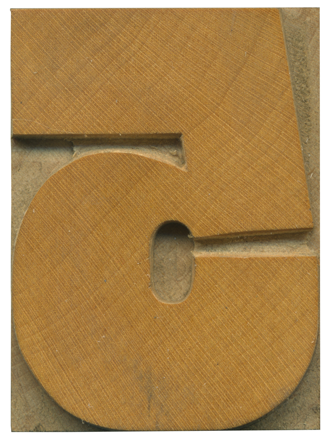
This block marks the return of Daily Blocks and a brand new set of type to analyze, and it also celebrates the release of the Eames typeface by House Industries, which features a lovely set of wood type inspired numerals, and the 5 in particular reflects this typeface (Nick Sherman showed me David Berlow’s Rhode typeface, which is also inspired by grotesque wood typefaces). This gothic face is a grotesque style with uneven stroke weights, and it’s quite bold, which of course I love. I also love how narrow the gap is in the middle on the right side of the block. It’s like trying to fit this voluptuous, thick winding line in a tight space and everything is a little crammed in. There are some really graphic shapes in the counters, I need to play with a reversal of this figure. The line is very thick everywhere except from the upper part of the curve, where it narrows considerable and it really gives the block a personality.
Many of the numerals in this set have barely been used, and I’d suspect they have only been pulled once, in red ink, as discussed by Glenn from the Museum of Printing in this post. The pantagraph marks are still fresh and rough around the edges
Style: Gothic
Style first appeared: Unknown
Size: 24 line
Manufacturer: Hamilton
Manufacturing Method: Pantograph
Is it part of a complete set? Yes
2 Comments on “Mid Century 5”
Leave a Comment
Related Posts
Nick Sherman
I think you misunderstood me. Erik von Blokland designed the Eames Century Modern fonts; I’m not sure if he did the numerals or not (House Industries doesn’t credit the designer of either on their site). David Berlow designed Rhode. They both are inspired by earlier grotesque faces like the one you show here.
03-29-10 » 11:06 am »
Bethany Heck
Yikes, sorry for the mistake, Nick.
03-29-10 » 11:09 am »