02.11.10
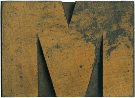
Is there anything better than a nice meaty wood type block? Of course not! This block is from a very early sans serif typeface which I adore, but have been unable to obtain a complete set of. The Rob Roy Kelly Collection has a very similar face. The letterforms are all quite mismatched and awkward and for whatever reason I love it. This M is quite extended, which doesn’t seem all that odd until you compare it with the almost perfect roundness of letter like the O. There’s just a touch of thick and thin on this block, most notable on the two main vertical stems.
This block has a great shiny surface, it’s melt in your mouth pretty (and bite size!). I love the ink stains on the upper right, they seem to start and stop in just the right places. Some small spots of ink carry over into the rest of the face, and it’s a little scratched up. You can just barely see the remnants of a router in the lower counters.
Style: Gothic
Style first appeared: 1838
Size: 10 Pica
Manufacturer: Unknown
Manufacturing Method: Pantograph
Is it part of a complete set? No


