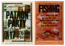


02.24.10
I absolutely love this letterform! It’s so round! It’s got the nearly perfect roundness, but you can tell it’s an early gothic face because of the irregularity between the weight at the serif and the spur. And despite the circular nature of the outer portion of the stroke, the counter is slightly more squared off. If you squint at it, it looks like an arrow looping around. So very graphic ...
Read More →
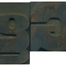
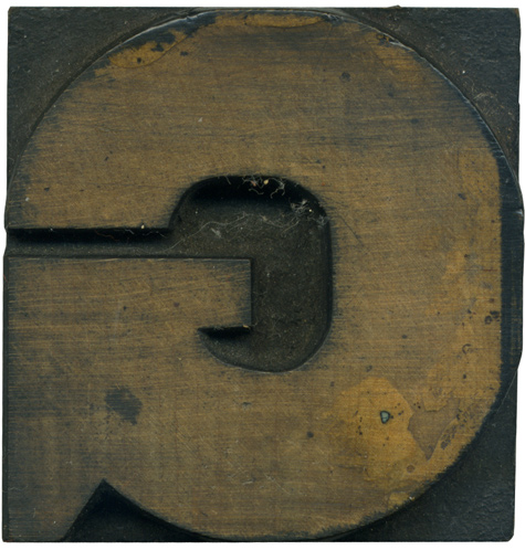
02.23.10
One of my favorite typeface in one of my favorite letters! This is from the hand carved Grecian set, so once again it features lots of weight contrast in the face and some irregularities from being cut by hand. I love the triangle coming in where the two bowls meet, it adds a lot of tension to that side of the block. This block cleaned up very well, you can clearly ...
Read More →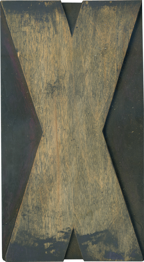
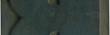
02.22.10
This giant X is from the modern poster lot. I find the tiny counters on the top and bottom to be fascinating, it’s really quite a meaty letterform. Most of the digital interpretations of this style of face seem to be rounded, but this X is all straight lines. It seems very vertically stretched, and the shorter counters only make it seem more strange. The face is mostly clean besides the ...
Read More →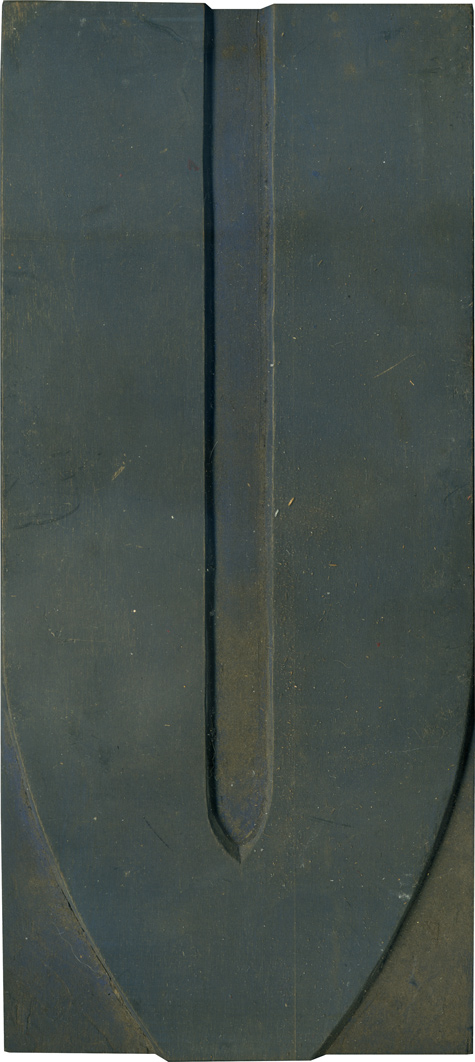
02.19.10
There are several Vs from the modern poster lot, each just slightly different than the next. This one has a very wide inner counter space, and might have been hand carved, as evidenced by the irregularities along the edged of the face. Many of the blocks from this lot that were simpler letterforms with straight edges were hand carved. The Vs from this style always look a little out of ...
Read More →