

02.10.10
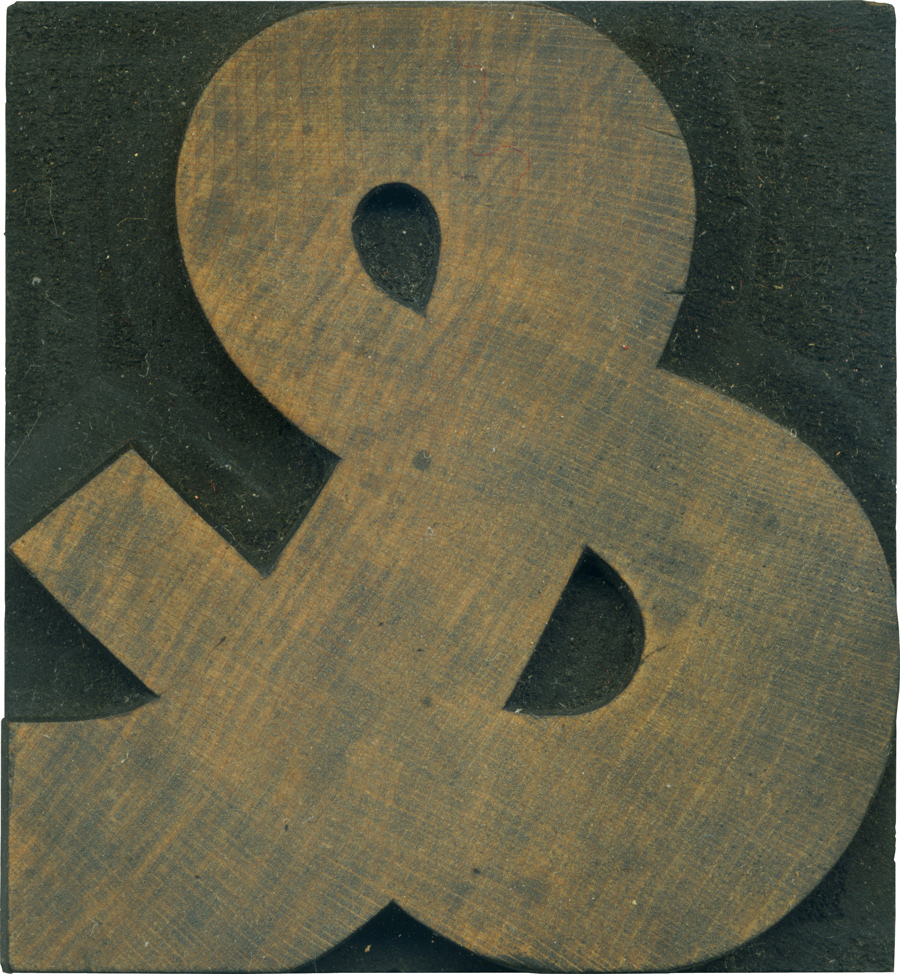
This ampersand is from the gothic set I have. Characteristic of the typeface, it has some variation in the stroke weight, though it’s not nearly as awkward as some of the very early sans serifs. I really love how the stroke widens at the bottom loop of the ampersand. It looks like a living creature coiled up upon itself. The thicker weight also lend it a stability and firmness some wood type ampersands lack.
The like a lot of the blocks in this set, the block wasn’t used extremely often, so the face has remained pretty clean, though the shoulder is dark. I’ve always liked the effect of a clean face and a dark shoulder, it really makes the letterform pop, and it’s one of the advantages of the lighter woods.
Style: Gothic
Style first appeared: Unknown
Size: 15 line
Manufacturer: Hamilton
Manufacturing Method: Pantograph
Is it part of a complete set? Yes
One Comment on “Voluptuous Ampersand”
Leave a Comment
Related Posts

Leanda
What a truly inspirational blog you have! Found you from Uppercase. This is now on my tumblr
02-10-10 » 11:16 am »