01.27.10
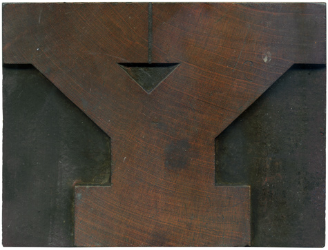
Another one of the lovely Antique blocks. One of my favorite things about this typeface is the arrows the counters make. They are so, well, bold, and graphic. The fact that the overall shape of the Y reflects the counter emphasizes that even more. This block has a great disturbance in the grain on the top left. I’m not sure what could cause a distortion like that, but it’s certainly interesting. ...
No Comments » Read More →01.26.10
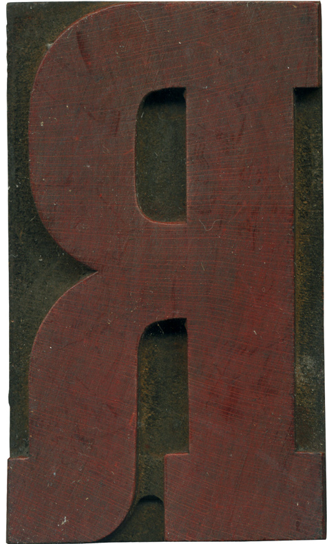
Here is another stray block from a mixed bunch of type I have. The typeface is a condensed antique, which I’m quite fond of. There’s a good amount of thick and thin in the face of the letter, which I find really interesting in a slab serif. The leg of this R is really wonderful, I love how it comes out of the bowl and fattens up to the weight ...
No Comments » Read More →01.25.10
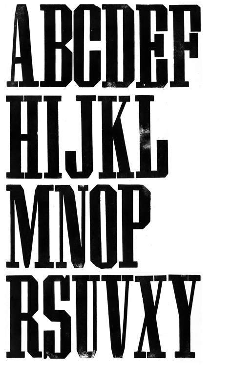
So, I thought I would post an update on the grecian typeface I bought a few weeks ago. After I got to look over the blocks, I ordered new materials to make plexi replacements for the letters that were missing. I noted initially that I didn’t think the typeface matched anything I had seen, and it turns out it’s a more obscure typeface than I realized. University of Texas at Austin ...
No Comments » Read More →01.25.10
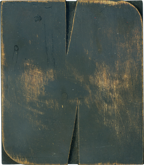
This N belongs with the smaller subset of the rounded sans serif blocks I got this past summer. I love how meaty this letter is! The letterform is so simple, but I haven’t seen many that match it. I assume this letter and the others in the group were based off some specimen that I’ve yet to run across in my searches. Another possibility is that it was a variant ...
No Comments » Read More →

