
01.25.10
So, I thought I would post an update on the grecian typeface I bought a few weeks ago. After I got to look over the blocks, I ordered new materials to make plexi replacements for the letters that were missing. I noted initially that I didn’t think the typeface matched anything I had seen, and it turns out it’s a more obscure typeface than I realized.
University of Texas at Austin Professor David Shields contacted me by email last week, offering to try to help me identify the typeface. He mentioned a hand carved typeface from the RRK collection that was similar to mine, and this prompted me to study the blocks I had. I was surprised to find no evidence of pantograph work on the blocks, and Professor Shields confirmed my suspicion, making visual notes of several photos I sent him.
Here is his analysis:
1) The lack of surface finish (the grain being so evident), indicating the wood was not prepared or finished to prevailing industry standards.
2) The lack of stroke consistency from glyph to glyph.
3) Broad scooped or chipped patterns on the shoulders.
4) Imprecise finishing at joining of face to shoulder.
5) What seem to be alignment lines incised in the face, (though this could have easily happened after the face was cut and have nothing to do with the production, just possibly coincidence that it would align).
6) The slight angling of the cut, rather than being perpendicular, to the shoulder.
7) The imprecise fitting of the face on the body of the block.

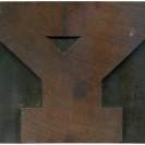
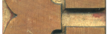
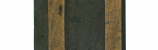
Here is a shot of the face to shoulder imperfections.

The surface of the blocks is unfinished, which would not have been acceptable at most wood type manufacturers.
He hypothesized that the set was cut to match a foundry specimen, because my set and the set from the RRK collection shared several characteristics. Unfortunately, he doesn’t know which exact cut the blocks were based on, and I haven’t been able to find a match either. This makes the blocks hard to date. Professor Shields has noted these two major variations from other wood type grecians:
1) The relationship between thick and thin stroke is much more contrasted than anything the wood type manufacturers were showing. All wood type manufacturers Grecian styles had either equally weighted strokes or only subtle contrast between the thick and thin strokes.
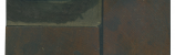
2) The amazingly thick serif on the cross bar of the E and F. While almost all of the manufacturers up through the 1880s had a seriffed cross bar—and many continued showing it into the 1890s & 1900s as well—none show one where the serif matches the thickness of the stroke of the body. (I have attached an image of the specimen page first showing a Grecian in wood type so you can get an idea of the differences. L. Johnson’s Specimen of Wood Letter, 1846—Darius Wells & ER Webb were selling select wood types through Johnson at that point. This image was shot from the specimen book held at Columbia University as part of the American Typefounders Library Collection at the Butler Rare Books Library.)

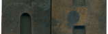
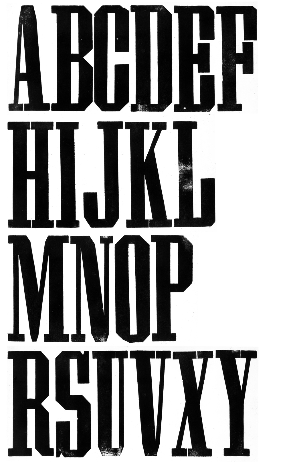
I combined two different specimen images from the Rob Roy Kelly collection website with the print of my own set to illustrate the oddities of the typeface. The end cut Grecian X Condensed has more traditional Grecian attributes. There isn’t a large amount of thick and thin contrast, and the serif on the E and F is thinner than the stroke of the body. If you compare that to the hand cut Grecian X Condensed from the Rob Roy Kelly Collection, you will notice it has much more contrast in the stroke weight, and the serifs on the crossbars are extremely thick. Moving to my set, there are some obvious similarities to the hand cut set from the RRK collection, but they are not identical. Several letterforms are slimmer, such as the A and the M, and the serif on the E and F are not as thick, and they are inconsistent from block to block. Also, I thought my eyes were playing tricks on me when I saw the slope on the top of the X, but it turns out it is actually a little crooked! Professor Shields believes that the typefaces were visually copied, resulting an non-uniform set.
In conclusion, what started as a harmless ebay purchase has turned into a full blown investigation! I never thought there would be anything out of the ordinary with this set, so to learn all of these unique details about the blocks is fascinating. What are the odds that I would have a typeface that was hand carved, and that the RRK collection held its long lost cousin? Now, my job is to hunt through specimen books and try to find a foundry type that has some of the same oddball characteristics of this set. I will post updates as I work to find the source for the typeface and create plexi replacements for it!
Leave a Comment
Related Posts