02.08.10
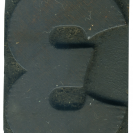
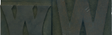
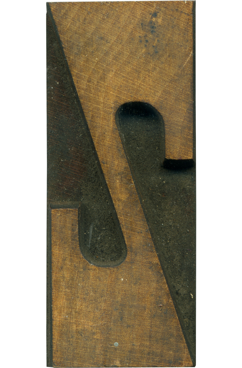
I like to compare the differences between the French Antique letterforms and the French Clarendon. The counters are rounded, unlike the squared off counters on the French Antique Z. It does retain the squared off ends of the stroke, though it does seem to convex slightly. I do like the contrast of the roundness and harsh angles. The curve isn’t perfectly round, it’s tighter on the side closer to the main stroke.
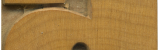
The face is really nice, you can clearly see the grain, which has lots of lovely tones. I like how it waves in the upper left. The wood on the shoulder just barely peeks through on the left.
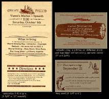
Style: French Clarendon No. 2
Style first appeared: 1873
Size: 12 line
Manufacturer: Hamilton
Manufacturing Method: Pantograph
Is it part of a complete set? Yes
Leave a Comment
Related Posts