


04.22.10
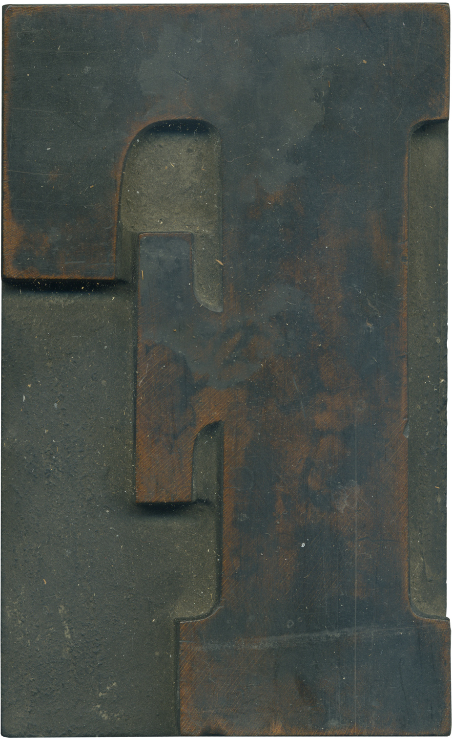
Oh my, this is a nice one. This is one of those letterform/typeface combinations that just belongs as wood type. It’s compacted and a little awkward, the arm of the F has a massive serif that juts up and nearly touches the serif on the top stroke. That top serif is absolutely huge, by the way. It’s the same height as the serif on the cross arm. The brackets on this typeface are very generous as well.
You can see the wonderful grain on this block, and with a bit of cleaning I know I can get it spotless. The counter space above the cross arm wasn’t cleared out by the wider router bit (you can see two router marks at the bottom of the top serif and the bottom of the serif on the cross arm). There are a few small scratches, but the block is in relatively good shape.
Style: Clarendon Condensed Bold
Style first appeared: Late 1800’s
Size: 24 line
Manufacturer: Unknown
Manufacturing Method: Pantograph
Is it part of a complete set? Not yet
2 Comments on “Clarendon F”
Leave a Comment
Related Posts

Stan
Clarendon Bold is one of my favourite display faces although the serifs at the foot of this style are a bit too compressed. Its the brackets which give it flow unlike egyptian slab serifs which one of my lecturers in the 50’s considered irratating, describing them as “like sand between the toes”.
04-23-10 » 6:40 pm »
Bethany Heck
This is an odd typeface, because the serifs are really “short” and the brackets are very prominent. Most wood type clarendons I’ve seen had taller serifs. Your lecturer’s characterization of “sand between the toes” is excellent! What a perfect way to describe the effect they have on certain letterforms with multiple vertical strokes.
04-23-10 » 7:21 pm »