10.21.10
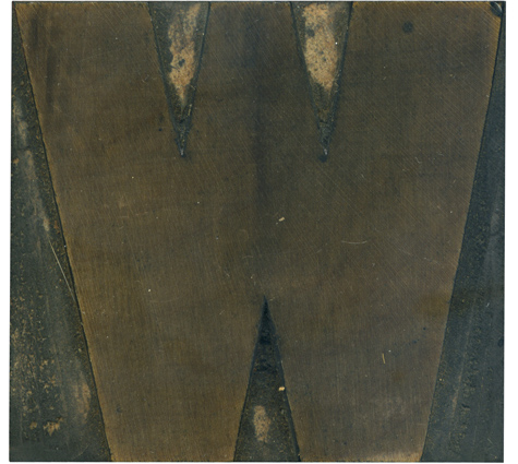
I think this block has a great rhythm in how the stroke weight shifts from right to left. The whole letterform is just barely asymmetrical, which is one of my favorite parts of this typeface. It’s more uniform than many of the old sans serif faces, but it’s not as geometric as the later gothic faces. You can see the rings of the wood radiating out from the top left of the block.
Style: Gothic
Style first appeared: Unknown
Size: 15 line
Manufacturer: Hamilton
Manufacturing Method: Pantograph
Is it part of a complete set? Yes


