
05.07.10
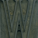
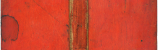
One of my favorite things about these older clarendons is that the top counter on letters like the R is completely rounded off, instead of having a straight edge next to the main vertical stroke. It really looks peculiar, especially in print. One of my favorite things about collecting wood type is seeing typographic details that didn’t carry over to modern day use. This R is incredible solid, the vertical strokes are very thick, but that doesn’t stop the R from looking smooth and natural. This block has a definite posture, he looks like he’s standing casually with a leg bent.
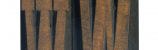
Style: Clarendon Condensed Bold
Style first appeared: Late 1800’s
Size: 24 line
Manufacturer: Unknown
Manufacturing Method: Pantograph
Is it part of a complete set? Not yet
Leave a Comment
Related Posts