


04.23.10
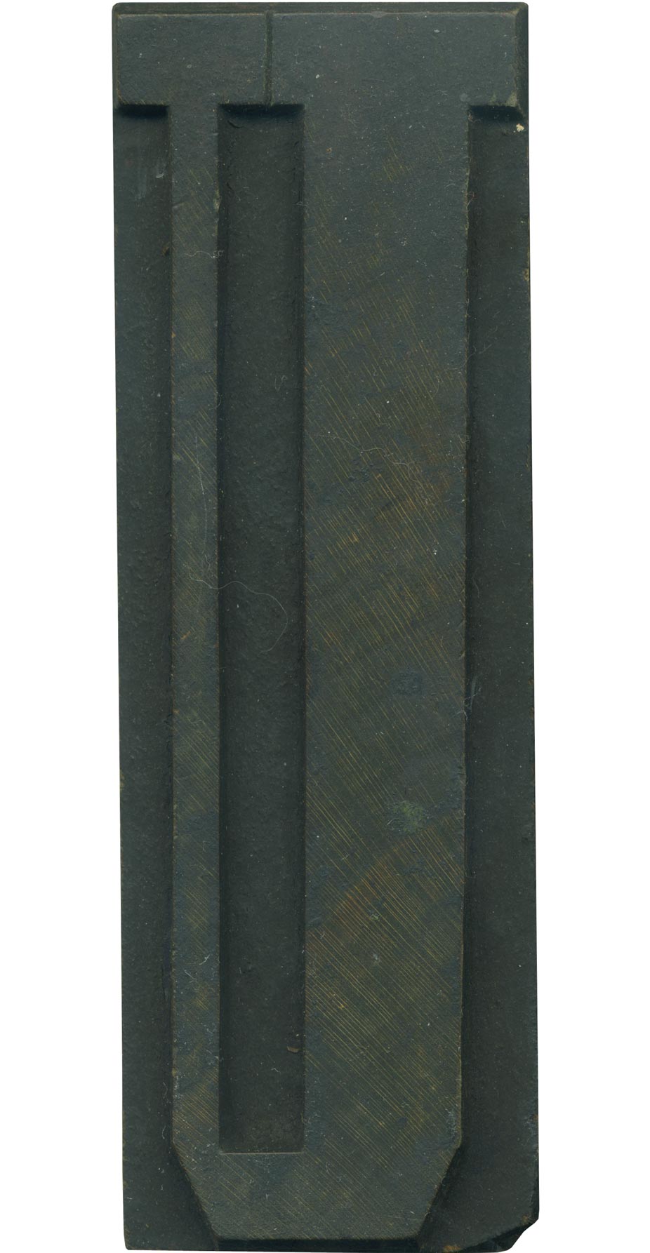
It’s neat to have such a simple, vertically oriented letterform in an extremely condensed typeface like this. The geometric corners only add to the weird, disorienting effect. Your eye almost has to travel down one side and up the other to recognize the letter. The counter space in the middle cuts dangerously low to the bottom stroke, almost cutting the character in half. The difference in stroke width on the two sides is startling.
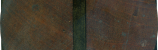
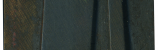
This block’s pretty grimy, put the grain peeks through on the right side. You can see the sloping from being cut by hand along the top of the block. The shoulder is damaged on the lower right, but it shouldn’t affect its usefulness.
Style: Unknown Grecian
Style first appeared: 1846
Size: 28 line
Manufacturer: Unknown
Manufacturing Method: Hand Carved
Is it part of a complete set? Not yet!
2 Comments on “U Grecian”
Leave a Comment
Related Posts

Christopher Skinner
This character is very nice. I’m surprised about that too – it’s not a style I would particularly appreciate. I love the fact that I even have to scroll down to see the bottom of the letter. It’s an extreme design, especially for it’s age, but I like it even more for that.
Lovely stuff Beth, really lovely.
I have been collecting metal type recently and enjoying the precision scale of typecasting, but these wood pieces of yours just do the business don’t they? Although I have been adding to my collection recently, I am rather jealous of yours!
All the best,
Chris
04-23-10 » 5:40 pm »
Bethany Heck
Chris,
I love pieces done with metal type, but I get so impatient with tiny precision work. I’m trying to add some smaller size alphabets to my collection, but I just have a soft spot for the bigger stuff.
04-23-10 » 7:35 pm »