07.20.10
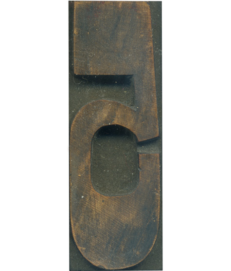
This is one of my favorite blocks from the French Clarendon set! I love how the proportions change on the lower half of the letter, and meet up with the straight angles at the top of the letterform. The curve at the top of the bowl is just perfect, and the inner bottom counter is much more squared off, which fits in with the rest of the typeface. I also love how that straight angle on the right side seems to continue naturally from the arch at the bottom of the figure.
The wood has stained beautifully, and there’s just a smidge of red ink left of the top left. There’s a lot of great color and tonal variation in the face, and you can just barely make out the grain patterns as well.
Style: French Clarendon No. 2
Style first appeared: 1873
Size: 12 line
Manufacturer: Hamilton
Manufacturing Method: Pantograph
Is it part of a complete set? Yes


