

02.08.10
I like to compare the differences between the French Antique letterforms and the French Clarendon. The counters are rounded, unlike the squared off counters on the French Antique Z. It does retain the squared off ends of the stroke, though it does seem to convex slightly. I do like the contrast of the roundness and harsh angles. The curve isn’t perfectly round, it’s tighter on the side closer to the ...
Read More →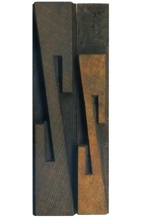
02.05.10
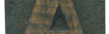
It seems appropriate to end the week with a Z. These are from the French antique condensed set, of which I’ve already posted the A and the W. The style is characterized by extremely tall slab serifs. I really like how geometric and symmetrical the Zs are, they’re really quite aggressive. I like how the squared counters mirror the ends of the stroke, and how they both contrast the angles ...
Read More →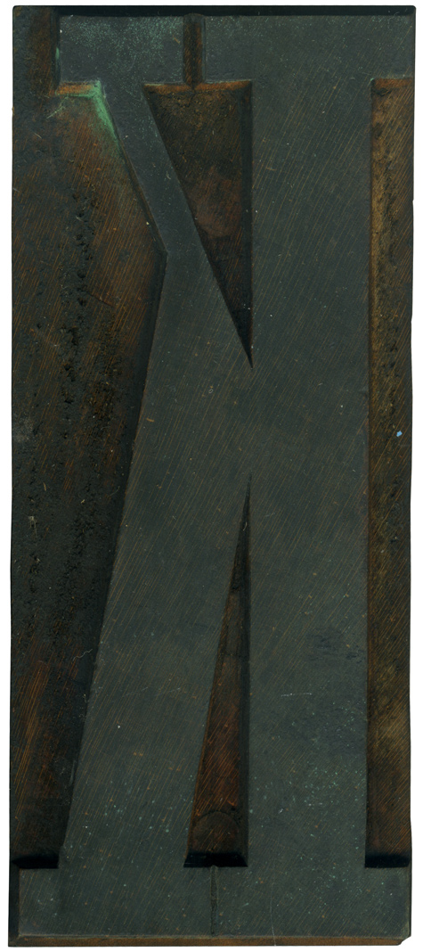
02.04.10
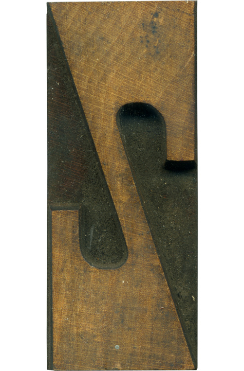
At the request of Mr. Christopher Skinner, here is another block from the Grecian set. This K has a lot of the characteristics of the overall set, with the exaggerated thick and thin strokes. I really like the difference in the negative spaces at the upper and lower vertices. The lower one in quite long and narrow, while the upper is wider and very short. It makes for a very ...
Read More →
02.03.10
There are a lot of little details in this block that I love. The letterform itself looks like an earlier sans serif, because of the thick and thin variations. It’s got an odd little round wound at the top on the upper middle of the face. The router levels are very clear in the upper vertices, you can see the deeper, wider cut above and the smaller bit below it. ...
Read More →