


07.21.10
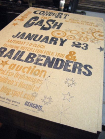
You don’t really know a piece of type until you print it, so when the school got the SP-15, I set out to reintroduce myself to some of my newer fonts. I actually don’t have a lot of experience printing on a press, which is evident in the fact that I had trouble getting even ink coverage on some of the fonts. The 514 set proved the most difficult. The type is very worn down and there was a lot of inconsistency in the height of the type, but to be honest, I like irregularity in prints.

This font is in bad shape, the the typeface is still one of my favorites

I’m not sure what caused those wounds on the W, but I love it
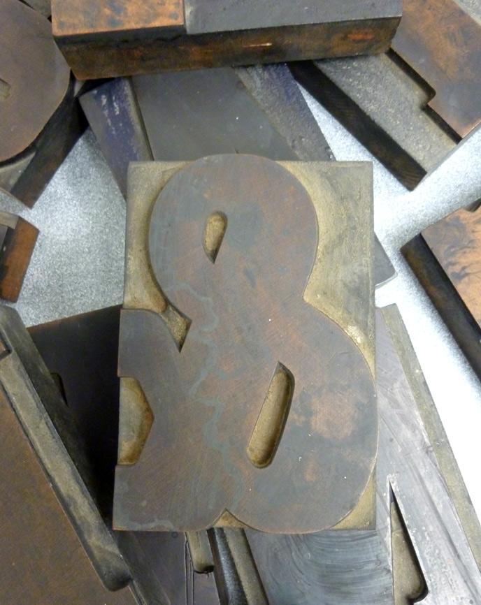
I was thrilled with the results I got from the Clarendon typeface. Almost every block has it’s own unique quirk and the prints had just the right amount of distress. I adore this typeface, and I love how big this font is.

One Comment on “Getting to Know Type”
Leave a Comment
Related Posts

Christopher Skinner
Beth! At last! I am really happy that you are beginning to print your woodtype. This is where the real joy (and frustration!) begins as you really get to experience the link between the artifact and its purpose.
I’d love to see one of the prints – if you are intersted in a print swap at any time, just let me know…
07-23-10 » 4:36 pm »