


03.02.10
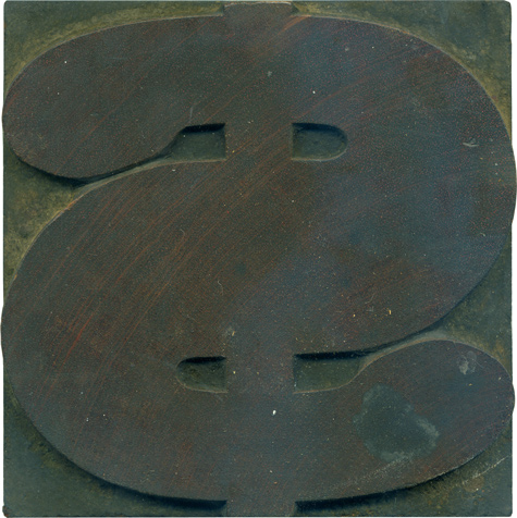
What better typeface to depict a dollar sign than a big meaty antique slab serif? I love the ball terminals at the ends of the stroke, and it’s a great way of making the dollar sign more than just an S with a line through it. The vertical line seems so frail compared to the heft of the swerving stroke. Even for this heft of a typeface, this figure is ...
Read More →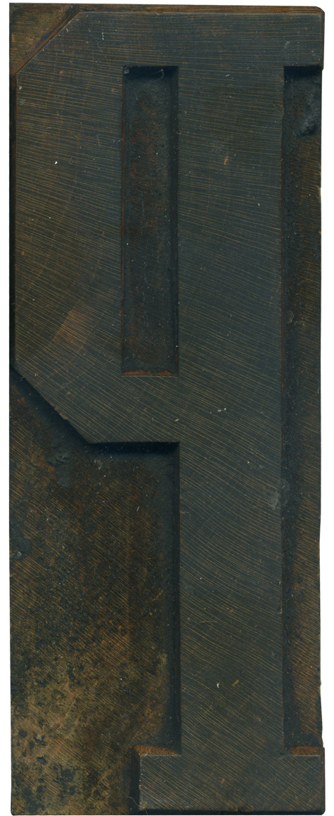
03.01.10
Continuing the blocks form the Grecian set, here in a rather stately P. I really love the differences in weight in this version of Grecian, and I like how those qualities and manifested in this letterform. The main vertical stroke is nice and thick, the horizontal weight forming the bowl are thinner, and the left side of the bowl is the same thickness as the stem. There’s also a variation ...
Read More →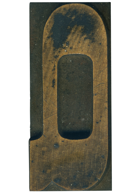
02.26.10
Qs are always a little weird in wood type alphabets. The nature of the medium limits them, you don’t see many that have a descending tail. Because of this, a lot of them end up being Os with a tail tacked on. Which is about what we have here, though it is still a nice letterform. The trail is quite chubby, it gives an interesting look to the letterform when ...
Read More →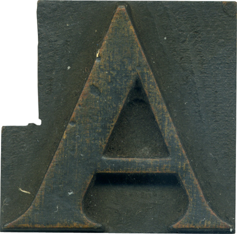
02.25.10
This is a quite small serifed A from one of the mixed lots I’ve purchased. It almost seems strange to see a more traditional typeface in wood type, because I’m so used to the ornamented, thick and chunky faces. It looks to be pretty similar to DeVinne, though it seems more extended than the version on the Rob Roy Kelly Collection site. DeVinne is the Old Style face that I’ve ...
Read More →