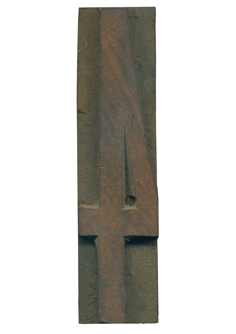
09.17.10
I am on a serious sans serif kick lately, so when I got the chance to get a super condensed set of wood type, I jumped at the chance. This 4 is a lovely little specimen. The letterform itself is very no-nonsense and has a great presence despite being so tall and lean. The work of hand finishing and pantograph carving is very clear on this block. My favorite part is ...
Read More →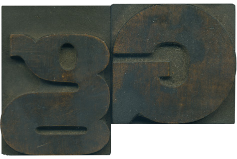
09.16.10
Is there a stranger creature in the wood type world than a lowercase G? They are often squished, disproportionate and deformed, but are almost universally charming. This little guy has a vertically oriented counter, but the bowl at the bottom is little more than a rounded horizontal slit. The connecting stroke in the center is basically the same massive width as the stroke on the uppercase letterform. It is fascinating ...
Read More →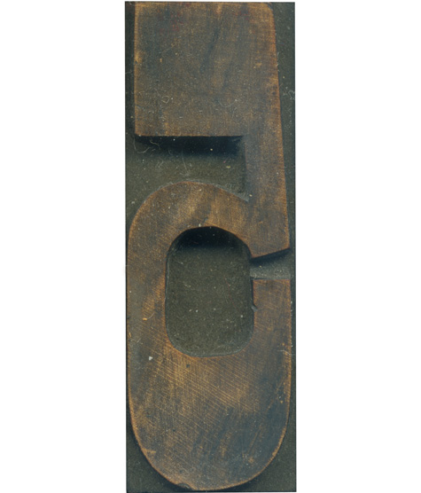
07.20.10
This is one of my favorite blocks from the French Clarendon set! I love how the proportions change on the lower half of the letter, and meet up with the straight angles at the top of the letterform. The curve at the top of the bowl is just perfect, and the inner bottom counter is much more squared off, which fits in with the rest of the typeface. I also ...
Read More →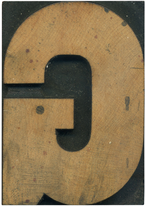
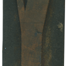
07.12.10
Style: Gothic Style first appeared: Unknown Size: 15 line Manufacturer: Hamilton Manufacturing Method: Pantograph Is it part of a complete set? Yes
Read More →