04.13.10
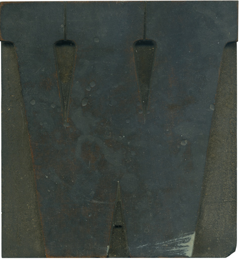
I‘m really becoming fond of this typeface, and I’m itching to print with it! This typeface has a more normally proportioned serif than the French Clarendons, with very rounded brackets. The brackets create a really nice counter shape in between the strokes of the W, it would be fun to use it graphically and play with that negative space.
Another filthy block. This one has several pot marks on the face that I’m sure will show up in printing. That whitish streak at the bottom is something that’s on a few blocks in this set. I think it’s paint, though it could be ink. This block will be stunning after a good bath, you can see the grain just barely peeking through.
Style: Clarendon Condensed Bold
Style first appeared: Late 1800’s
Size: 24 line
Manufacturer: Unknown
Manufacturing Method: Pantograph
Is it part of a complete set? Not yet


