03.30.10
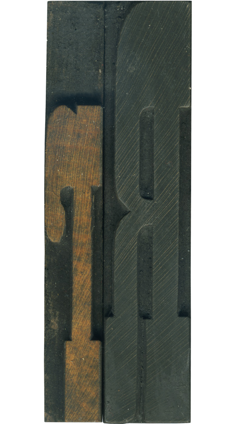
I love these upper and lowercase pairs! These are from my French Antique set, so they feature exaggerated slab serifs. I love the slope on the bottom right side of the leg on the uppercase block. It gives it that little touch of personality. The lowercase R is very playful with its curves and short stature. If you look very closely at the lower serifs you can see the height ...
No Comments » Read More →03.29.10
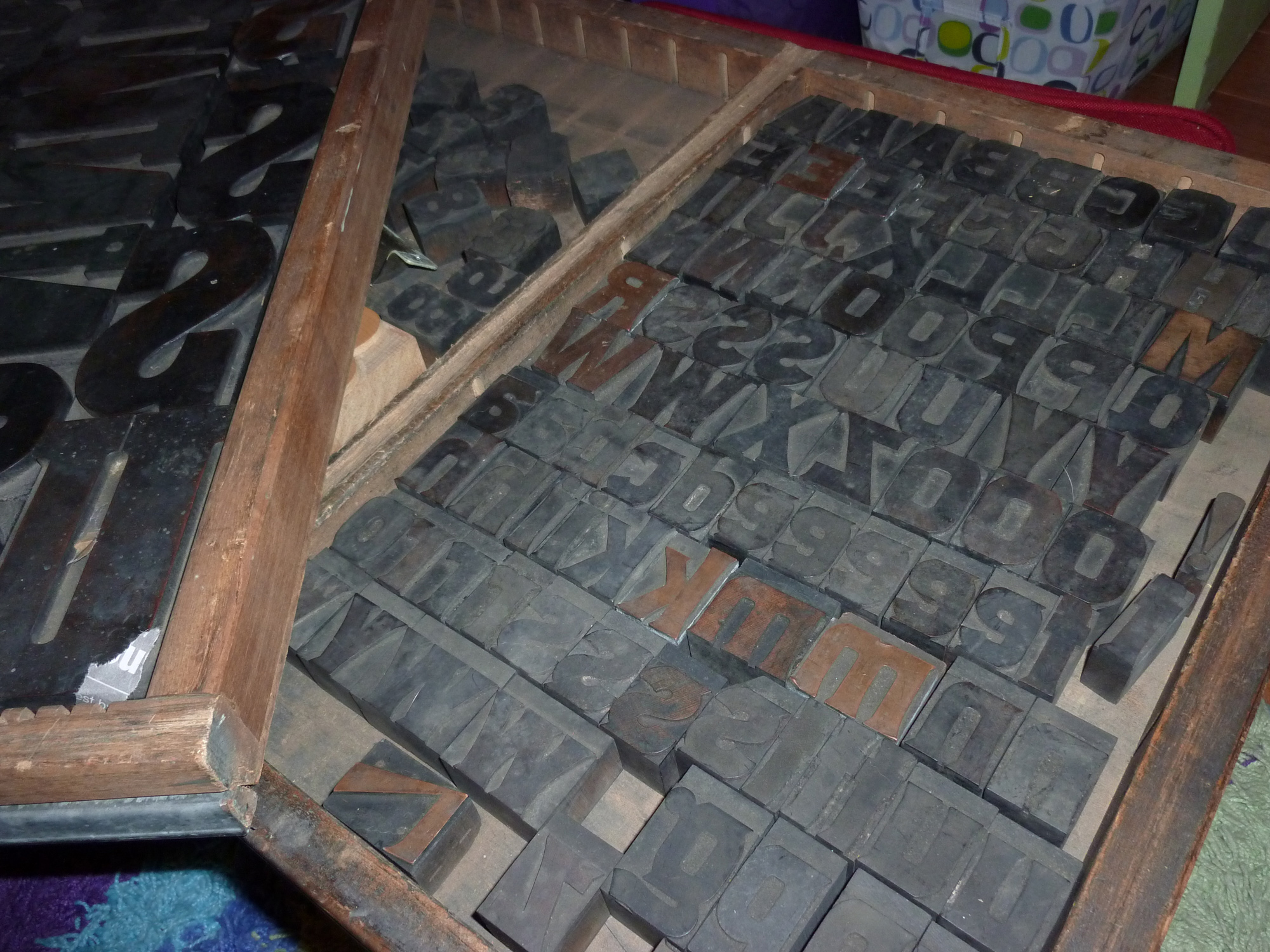
While I was in Dublin, 3 new alphabets arrived in the mail! I will have in depth notes about each as time goes on. There is a 5 inch set of Clarendon Bold which is more incredible than I could have imagined. I love getting fonts at this size that are made with End Grain wood! The next set is a 2 inch gothic that I’ve been dying to get ...
2 Comments » Read More →03.29.10
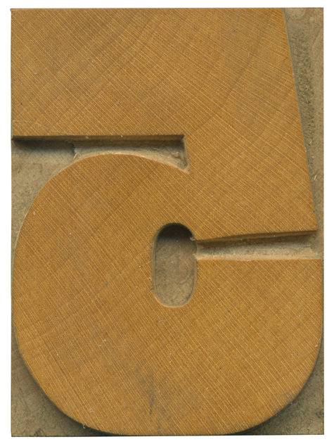
This block marks the return of Daily Blocks and a brand new set of type to analyze, and it also celebrates the release of the Eames typeface by House Industries, which features a lovely set of wood type inspired numerals, and the 5 in particular reflects this typeface (Nick Sherman showed me David Berlow’s Rhode typeface, which is also inspired by grotesque wood typefaces). This gothic face is a grotesque ...
2 Comments » Read More →03.28.10
Well, I have returned home in one piece! Dublin was incredible, and I got to see two great sites related to printing and wood type. I will do big write ups on both the National College of Art and Design and the National museum of printing soon, but I thought I’d heave a little teaser with some of the photos I took while I was there.
1 Comment » Read More →




![PROFESSOR TOBIN […] SPIRITUALISM’S HUMBUGS / SPIRITUALISTIC JUGGLERY / EXPOSED 💀](https://live.staticflickr.com/65535/54098372074_20bc775da2_s.jpg)
![HERR DOBLER […] ✠ DARK SEANCE ✠](https://live.staticflickr.com/65535/54097172372_f3d1807bd4_s.jpg)
![HERR DOBLER […] DARK SEANCE 👻](https://live.staticflickr.com/65535/54098371949_d42db78b79_s.jpg)


![Red Roses Press [Wood Type]](https://live.staticflickr.com/65535/53488240739_825eec6c1e_s.jpg)


