04.05.10
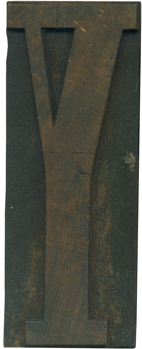
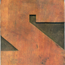
This is a lovely block from the Grecian set. I love the proportions of weight between the two arms on the Y. The block looks rather stately, the arms split from the stem in just the right place, so it doesn’t seem unstable. The serifs along the top are not perfectly even, a byproduct from this block being hand carved. It is definitely thicker on the right side. There is ...
No Comments » Read More →04.02.10
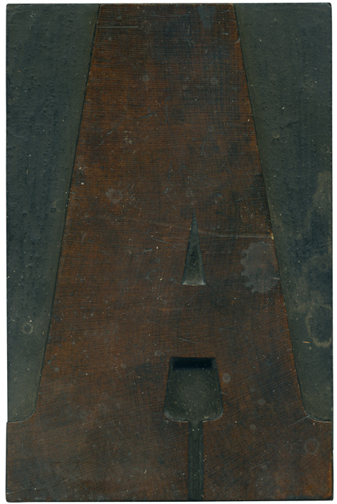
Here is a brand new typeface on this wonderful Friday! Clarendon typefaces like these work so well as movable type, I was thrilled to be able to get this typeface at this size. This is a bold clarendon face, and has a shorter serif height than most of the clarendons I’ve seen. It’s more like a condensed columbian, or a more modern clarendon. There isn’t a manufacturers stamp, despite the ...
No Comments » Read More →04.01.10
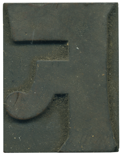
What a great introduction to this bizarre little typeface! The set I have is a little mismatched, but most of the blocks seem to come from this Number 514 typeface, first seen by Page and Setchell in 1887 (many thanks to the Rob Roy Kelly Collection site, as always!). The font in the RRK collection is die stamped, and this set might be as well, I haven’t seen evidence of ...
4 Comments » Read More →03.31.10
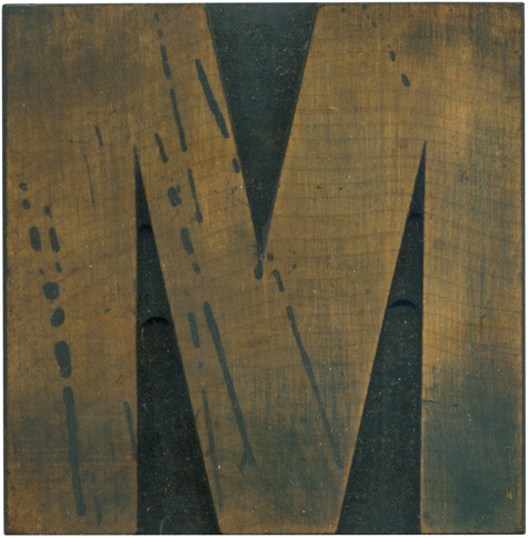
I just realized that I post a lot of Ms for the Daily Blocks. This one is from my first Grotesque set, and as such is a little off kilter, with contrast in the stroke weights. I’ve always been fascinated in the differing angles in uppercase Ms, and how the weight shifts from side to side. The stain splatters are the most defining features of this block. These aren’t just sitting ...
No Comments » Read More →


