


Here’s the poster type next to the 2.5 inch tall gothic set.

It’s a sea of beautiful type!
When they type arrived, I was stunned at how large it was. It’s one thing to read about 8 inch type, it’s another to hold it in your hands and then print with it! After sorting and examining the type more closely, I noticed that there was several variations of the same letterforms. There are 4 different Es, all the same height and style, but they have different weights and widths, and the corner radii vary as well. I think it is interesting that someone had so many variations on the same style face at that large a size, and it demonstrates the need for print shops to constantly be producing new styles to stay viable.

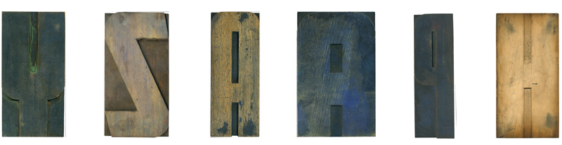
Many of the blocks from this set have mostly straight lines, and when there are curves, they are geometric. Some of the router lines are really irregular near the shoulder, but the cuts on the faces are pristine. As discussed previously, I think this was due to the final pantograph pass being a little deeper than necessary, and the first passes were at a shallower depth. Normally all passes would have been the same depth, so the final cuts would be impossible to see. Multiple pieces of the type have pencil marks coming out of the counters, such as the H. I think this block was hand cut, because of the simple form and lack of pantograph marks. The blocks were cut side grain, and the wood used seems to be pretty consistent. I discovered a penciled note on the back of one of the Vs, but have been unable to figure out what it means. It seems to have the word “raisin” and the letter “S”. Other blocks are backed with thin sheets of paper, which might have bring to bring their height up to match the other blocks. Overall, they look a little sloppy, but they still print well.

If anyone wants to take a stab at what this says, send me an email

This H and several other blocks, like one of the Os and Us, were chiseled by hand, as the pencil marks show.
I have not been able to find a close match for many of the letterforms, such as the Ms. The alterations between letterforms add to my confusion, like as the differences in the Js. Some of the Js originally had an angle on the end of the stroke, which was later flattened out by the printer. So, were the producers of this type copying other typefaces, or are these original interpretations of a popular style? I love the imperfect and unique feel of this lot, and I’m sure I’ll be studying it for quite some time.
Many thanks to Nick Sherman for his help in writing this and many other posts.
EndGrain » Gigantic B
[...] in this nice typeface at such a large size is a real treat. Unlike some of the letterforms from the large poster lot, this B has some really nice variations between the curves, specifically the joint between the two [...]
03-08-10 » 7:30 am »