03.13.10
The End Grain will be on a brief hiatus while I am in Dublin for a school trip. I apologize for this, I wanted to have posts published while I was away but for whatever reason I cannot get the feature to work. I’ll return on the 24th with letterpress news from the National College of Art and Design and lots of photos!
1 Comment » Read More →03.12.10
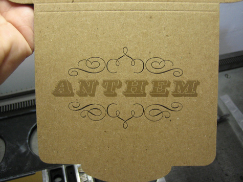
Interrobang letterpress is based out of Jamaica Plain, Massachusetts and run by Michael Babcock. Michael has an amazing collection of wood and metal type. You should definitely check out his flickr page and browse the multitude of images of his wood type and the specimens from his beautiful and unique metal typefaces. Michael’s work with small, delicate type is perfectly done, and he is just as skillful using larger type ...
No Comments » Read More →03.12.10
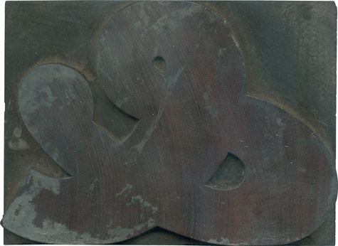
Have you ever seen anything more glorious than this block? Of course not! It’s a gloriously meaty, delightfully curvalicious ampersand with beautiful color shifts in the wood, peeking out from the caked on gunk it acquired from everyday use. It is, like my favorite wood type letterforms just a little awkward yet impossible to ignore. This comes from the Antique set, the major identifier being the ball terminal on one ...
3 Comments » Read More →03.11.10
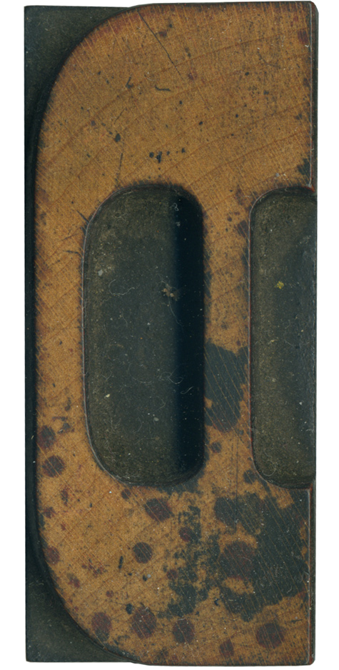
I love this spotted D. It’s from the French Clarendon set, so it has brackets and large slab serifs. I love how the brackets on the right side of the vertical stroke mirror the angle in the counter. This block is very clean outside of the beautiful spots of ink that have stained it. There’s some red along with the black, it’s a really cool effect. The grain has some ...
No Comments » Read More →
