


02.09.10
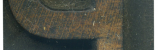
Of all the Js in the modern poster lot, this is my favorite, if only for that little angle at the end of the stroke. A few of the other blocks had details like this at one time which were leveled off for some reason or another. This has one of the thicker weights from the set, which I think contrasts nicely with the flashy little slant. Looking at typefaces in this style, some make very liberal use of the angled stroke ends, though its use seems pretty inconsistent. It seems most digital interpretations of this style have a J where the stroke doesn’t arch back upward like the ones I have. It’s always interesting to me to look at wood type styles that have survived into the digital realm, and see which qualities made the cut, and which didn’t.
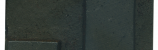
There is a faint trench along the shoulder from the smaller router bit being a bit longer than the larger one used to knock off the rest of the shoulder. The block doesn’t have any distinct colors outside from a faint trace of blue on the left side. Many of the blocks in this size and weight have that color lingering.
Style: Airport Tourist/ Futura Display variant
Style first appeared: 1932
Size: 48 line
Manufacturer: Unknown
Manufacturing Method: Pantograph
Is it part of a complete set? No
One Comment on “J with a twist”
Leave a Comment
Related Posts
alli b
love love love the tiny detail making this one so very different. so thrilled to have found your site. i am a wood type worshiper myself.
02-12-10 » 12:01 am »