
01.13.11
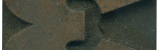
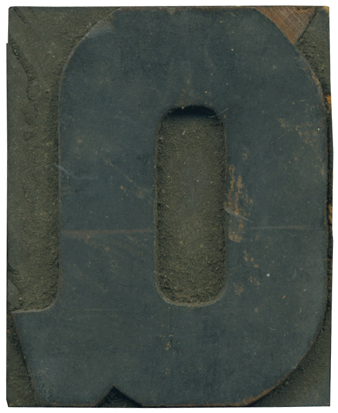
I don’t post nearly enough Q’s on End Grain. This guy used to be a part of the 514 die stamped font that Page first produced in 1887. But you can see where the top triangle flourish has been trimmed off, presumably so the letter would match another similar typeface. It’s still a lovely letterform. This style has a very nice combination of straight lines and hard angles with some nice curves lines. The tail is pretty substantial, often you’ll see wood type Q’s with tiny and tacked on tails.
Style: Number 514
Style first appeared: 1887
Size: 8 line
Manufacturer: Page
Manufacturing Method: Die Cut?
Is it part of a complete set? Not Quite
2 Comments on “Modified Q”
Leave a Comment
Related Posts
Kevin Lee
Hi Bethany:
Yes, this is the Braves fan. I followed your link about the interview on Tuesday and wound up here.
This letter “Q” is so pretty that I thought you might be the right person to ask this question.
Has the cursive capital “Q” disappeared from popular use?
I could never perform it–looks like the number two–but I rarely see the one taught in grammar school, instead seeing a large printed capital “Q” substituted.
I have to admit I prefer a printed “Q” for its looks, but what should I teach my grandaughter?
01-18-11 » 9:32 am »
Bethany Heck
I’m not sure what the answer is to that, Kevin. I’ve been under the impression that cursive has been fading from school systems, so it might be that the lovely cursive Q is vanishing. There are actually wood type alphabets that have that style Q.
I for one would be glad to see cursive go to the wayside, I never had a steady enough hand to do it justice.
01-18-11 » 11:05 am »