04.07.10
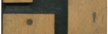
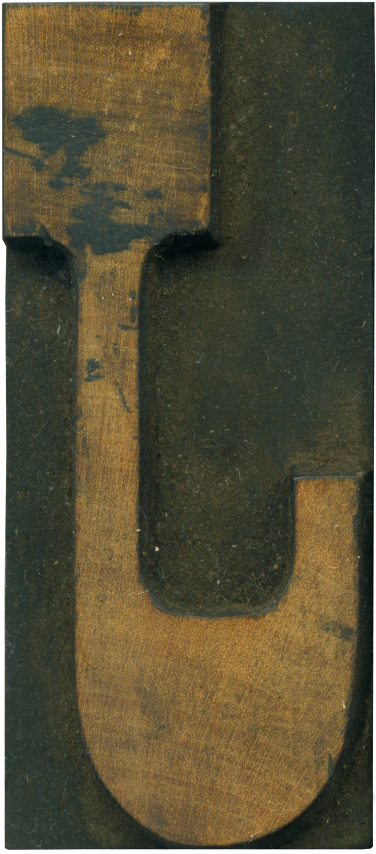
Apologies for not posting a block yesterday, I have been feeling under the weather. Looking at J’s backwards always seems particularly discombobulating. The thickening of the stroke at the bottom is so extreme it dwarfs the serif at the top. I love the sort of squared off counter area above the “hook” of the J. The end of the stroke looks kind of unfinished being lopped off like it is.
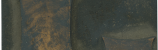
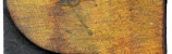
I love the golden tint of this wood, and it’s interesting how it gets darker at the top. There’s a nice liitle splotch of ink near the top serif, and a small cut there as well.
Style: French Clarendon No. 2
Style first appeared: 1873
Size: 12 line
Manufacturer: Hamilton
Manufacturing Method: Pantograph
Is it part of a complete set? Yes
Leave a Comment
Related Posts